The Mill Creative
Forging a brand and website for a singular craftsman worthy of his unique creations.
If he wanted to, Elliot Stevens could probably build just about anything. With a deep background in construction and project management for some of the Bay Area's most forward-looking companies, he has long been shepherding massive pieces of infrastructure into existence. From factories for Tesla Motors to skyscrapers in Oakland, Elliott has a lengthy outward history of contending with giants. Yet, hidden beneath all that lay a second core craft that is much more intimate.
Elliott designs and builds custom furniture for homes, by hand, from scratch. He uses reclaimed wood, metal, and concrete. His approach is direct, instinctual, and often captivatingly novel. His designs are elegantly minimalist — simple, precise works of highly functional, beautiful modern art.
This artisanal impulse lives in his bloodline. In Santa Cruz, his grandfather used to snag stray lumber whenever he had a few extra bucks in his pocket, and used it to gradually assemble what became a generational family home. Elliott's own first experience with his craft was a charming echo — many years ago, upon finding himself with some spare housing wood, he decided on a whim to construct a special dollhouse for his then-young daughter. The bliss of creation hit him hard and the rest, as they say, is history.
A Brief Story About A New Desk
My professional relationship with Elliott began when I commissioned a standing desk from him. To be clear, I am not what one would call a "furniture guy." There are very few objects that I care about. I tend to view possessions as ballast, and become quite giddy when getting rid of something. Acquisition, of the other hand, is a necessary but cringe-worthy evil.
That said, I really needed a proper place to work. And here's the thing: I technically already owned a standing desk. My relationship with it, however, was becoming highly adversarial.
Let me start with my incumbent desk: it was IKEA-Star-Trek-modern, with a near-weightless particleboard top and hollowed out aluminum tube legs that telescoped up and down to adjust height. It seemed vaguely space-age. But it wasn't actually space-age — I am confident NASA wouldn't let this thing anywhere near even a low-priority mission. The slightest nudge would shift it around on the floor. The legs would secretly telescope of their own volition over time, so that I'd shuffle up to it in the morning to find my monitors at waist height. One of the legs gave out completely, and I had to supplant it with a colorful stack of free weights, found bricks, and math books I had given up on ever reading. None of this was ideal.
Four weeks later, enter Elliott's finished commission. The top was a single lacquered plank from a redwood trunk, with all the natural features and contours left gently sanded but intact. The legs were comprised of 2-inch steel columns, welded together where stability mattered, then connected with bolts at a few key points to allow for painless disassembly and transport. It was a single height — a pre-established perfect working height for me — which is all I ever wanted in the first place. It had a much smaller footprint than the Star Trek desk, yet somehow there was always abundant room on its top. It was satisfyingly heavy when assembled, but trivially easy to move. It was simple, sturdy beyond belief, and stunning to look at.
I had never been emotionally impacted by a household item, but the redwood desk was different. It felt uniquely created for me. It occurred to me how incredibly rarely our modern world provides such a feeling, and I found myself treasuring it deeply. The desk was so beautiful, and took up so little space that I moved it out of my designated home office and into my main living area. I got up earlier and got more done each day. I converted my old office into a mini-gym and a proper photography studio. I took more pride in my home and started cleaning and tending to it more. I began a freaking daily gratitude practice.
Younger versions of me would never believe it, but this all actually happened — a piece of furniture changed my life.
Business Website
Shortly after, and much to my delight, Elliott commissioned me back — could I build an online presence for the Mill? Needless to say, I jumped on it, and was determined to take all the facets of my wonderful new desk experience and transmute them directly into a worthy website.
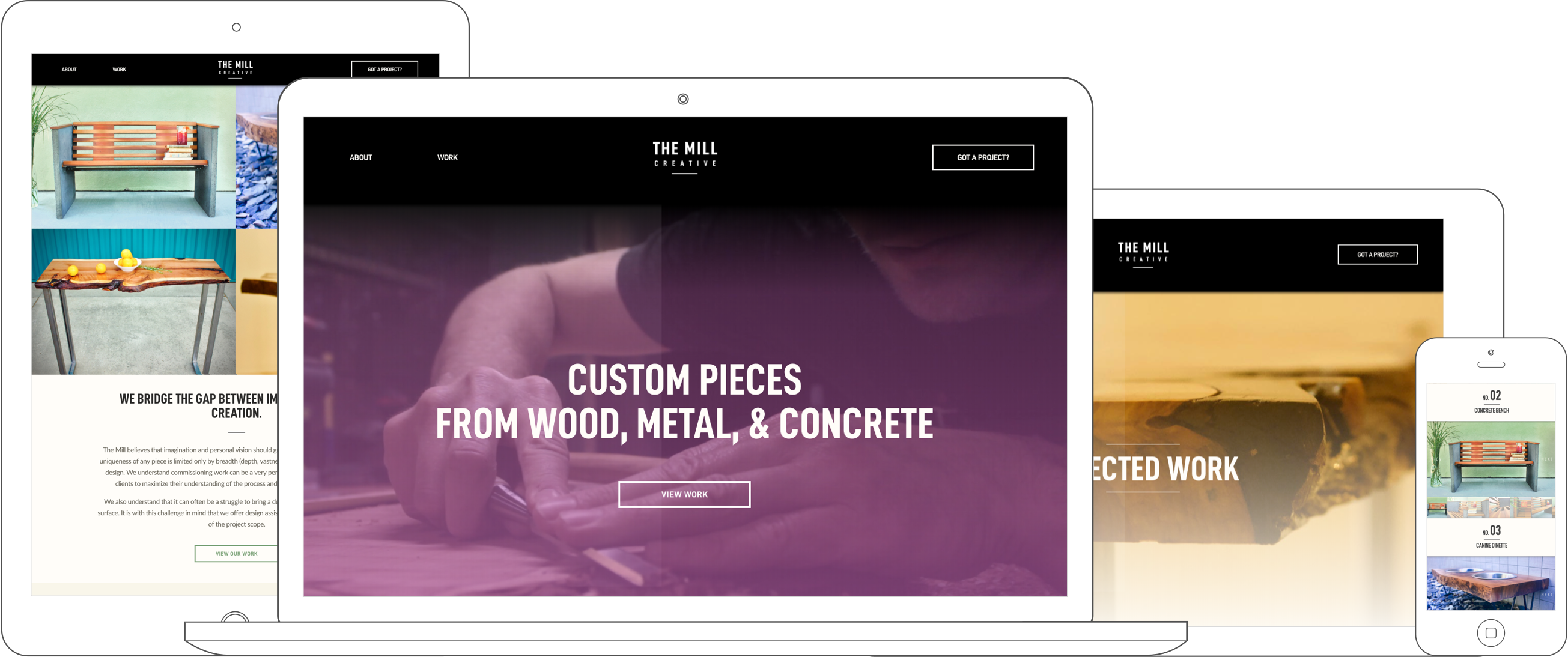
The signature of Elliott's craft seemed to me a little different than other bespoke furniture shops in the area. For one, most others seemed to put a very heavy emphasis on wood, whereas he consistently incorporated metals and concretes as equally vital design elements. His methods were just as much machine shop as woodworking studio. I also felt he had an identifiably singular aesthetic: a highly modern, rugged, all-bolts-exposed industrialism expressed with lyrical simplicity and sensitivity. The engineering was lucid and tightly economic, with every element having a clear purpose down to the smallest screw, and no unnecessary flourishes. Yet each piece was undeniably shaped by someone with an artist's heart and a deep sense of design.
I set these as my ground-floor principles to guide the creation of the Mill's site and brand.
Iconoclasticism
Here's one question invariably faced by fledgling brands — exactly how much should one embrace the conventions of their industry, or consciously go against them?
Generally speaking, one should look for established practices and heed them — starting a business is difficult enough, and if others follow certain patterns it is almost certainly because they are smarter than you and these things actually work. In a landscape where folks are mostly just stumbling around failing, this is free priceless wisdom.
On the other hand, you want to stand out amidst the fray. I mean, it's basically mission critical. Without giving customers reasons to choose you over your more established colleagues, you're dead in the water.
As we began brainstorming site structure, our version of this question popped up: what is the first thing that new visitors see? Every other custom furniture shop was showing their products first. Granted many of these were these giant emporiums with double-nested categories and thousands of choices, which to me felt oh-so-ten-years-ago and not at all the vibe we were going for. But some of them were lean, modern, and were getting it really right.
The logic to this approach is obvious enough: show what the artisan actually does. Don't fuck things up by being clever. Customers don't care about you, they care about finding a new bedframe. And this is all true.
On the other hand, how many more austere sheet-white minimalist gallery-style websites does there need to be? Couldn't we do something different? How do you avoid launching a wannabe version of things that already exist? As an alternative to the norm, I had been eyeing some video footage I took of Elliott's build process which seemed to beg to be collaged together into a video background.
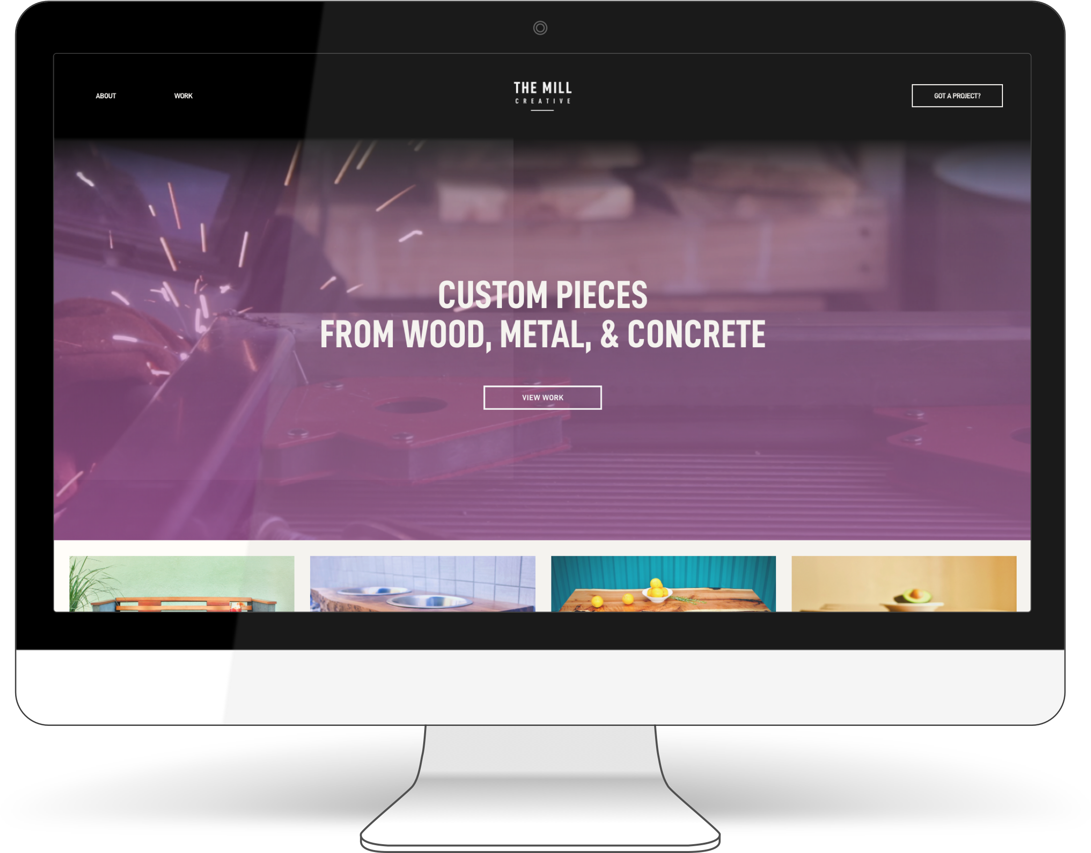
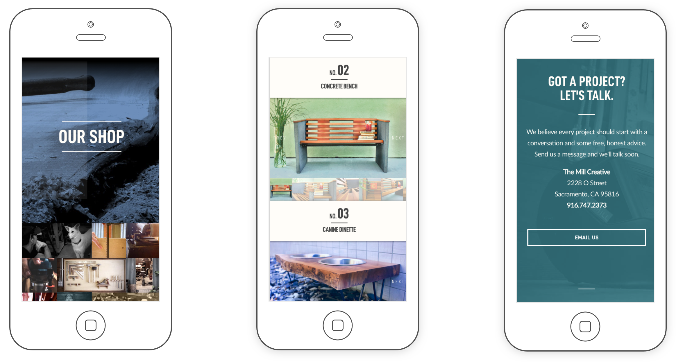
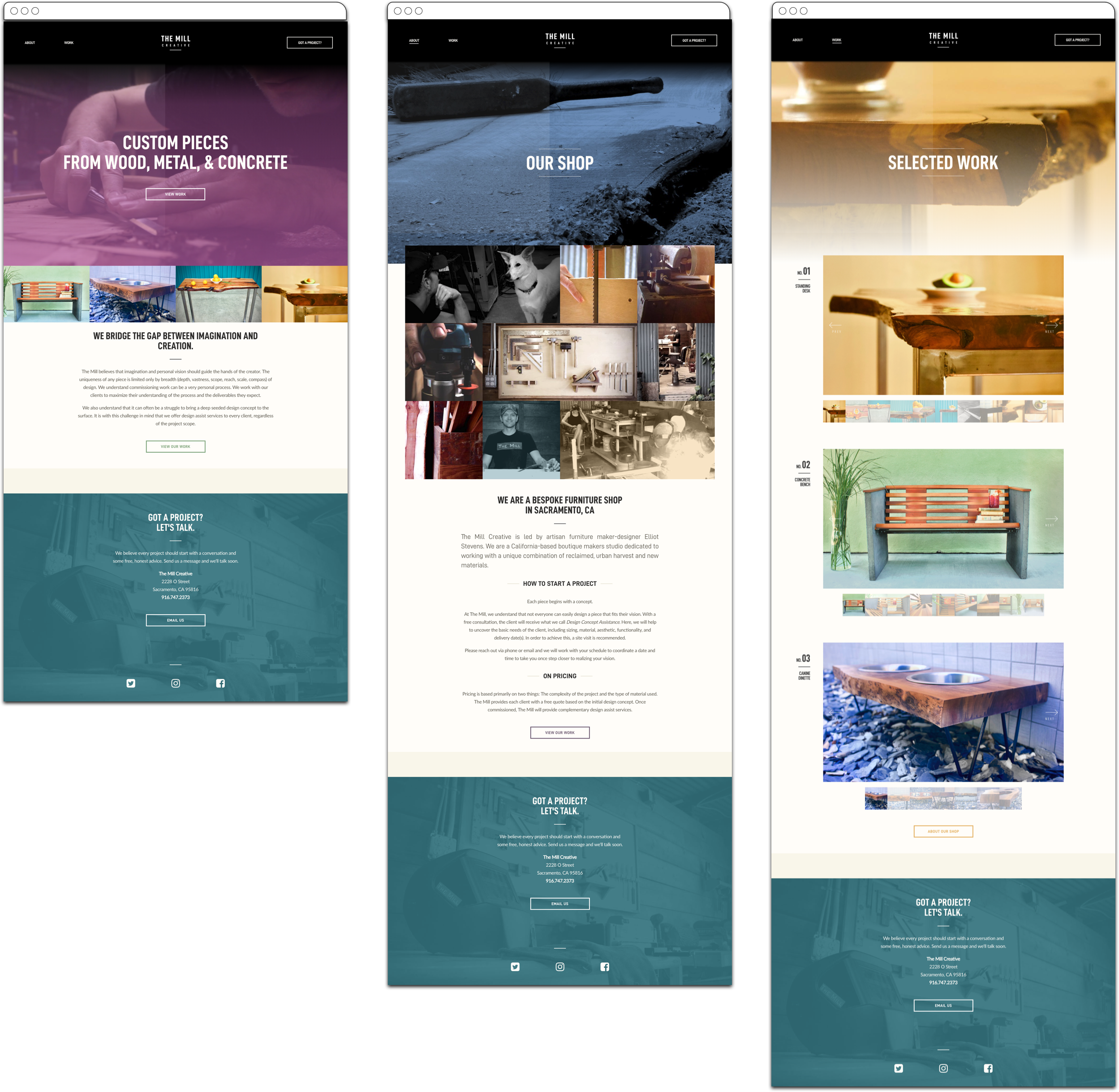
In the end, we chose to swim upsteam, while splitting the difference as much as possible. The homepage would open with a marquee and video of the build process along with a call to view the product page, with product photos already in sight immediately below. We reasoned this would not feel like an impediment or hassle because the site structure was so simple, and because the site flow was clear and direct: through single-choice calls to action, visitors were taken from the homepage video, to the work page, the about page, and finally to a contact form. This form was the footer of every page, so if they were convinced early they could "skip to the end" at any time.
Black & White to Color
I had originally envisioned a newsprint-style site with black and white video of Elliott working. I figured this would highlight the rich golds and reds of the wood in the furniture, while otherwise keeping to a gritty, industrial vibe. I was thinking where everyone was doing the white background thing, we could stand out by going dark instead.
I had worked up a version of this that seemed to me... eh, good but not great. Fortunately, my wife Laura — who's superior taste to mine is reliably proven — was around, and I managed to pester her into giving me her reaction. She immediately suggested that the video background be tinted purple. I couldn't envision this at all (I'll blame a gendered upbringing), but she was unwavering. So, I made a rough purple version. Once we saw it, it was a clear eureka moment: the look and feel of the whole brand should be industrial, yet consciously colorful. It should be furniture showroom set up in the midst of a construction yard. All other design decisions quickly cascaded from this realization. We went full technicolor.
The final takeaway here? It's pretty nice to have your partner around when you work.
Photography
In the web design space, it's an eye-rolling platitude: great images make a great website. Well, it's a real thing. This is why there is often a letdown when customizing templates from services like Squarespace — those templates really do look amazing, but this is in large part because their placeholder images look amazing. Unless you have equally gorgeous (and cohesive) images of your own to replace them with, the quality of the design will sag downward accordingly. It's the same feeling you get after you buy new clothes because of how the fashion models look in them.
The Mill was is no way exempt from this rule. We had our little purple video montage, but the main thing was to show visitors what they dang well clicked through for: pretty pictures of custom furniture. This meant product photo shoots. Our "colorful construction yard" principle had yielded us a concept: we would find industrial structures in the area with outdoor walls that matched our color palette, bring each piece in front of a different background, then stage it with cute little household items like they do in high-end boutique furniture catalogs. This would clearly involve a completely inexpedient amount of labor, but appeared so pleasing in my imagination that I gave up on being more sensible.
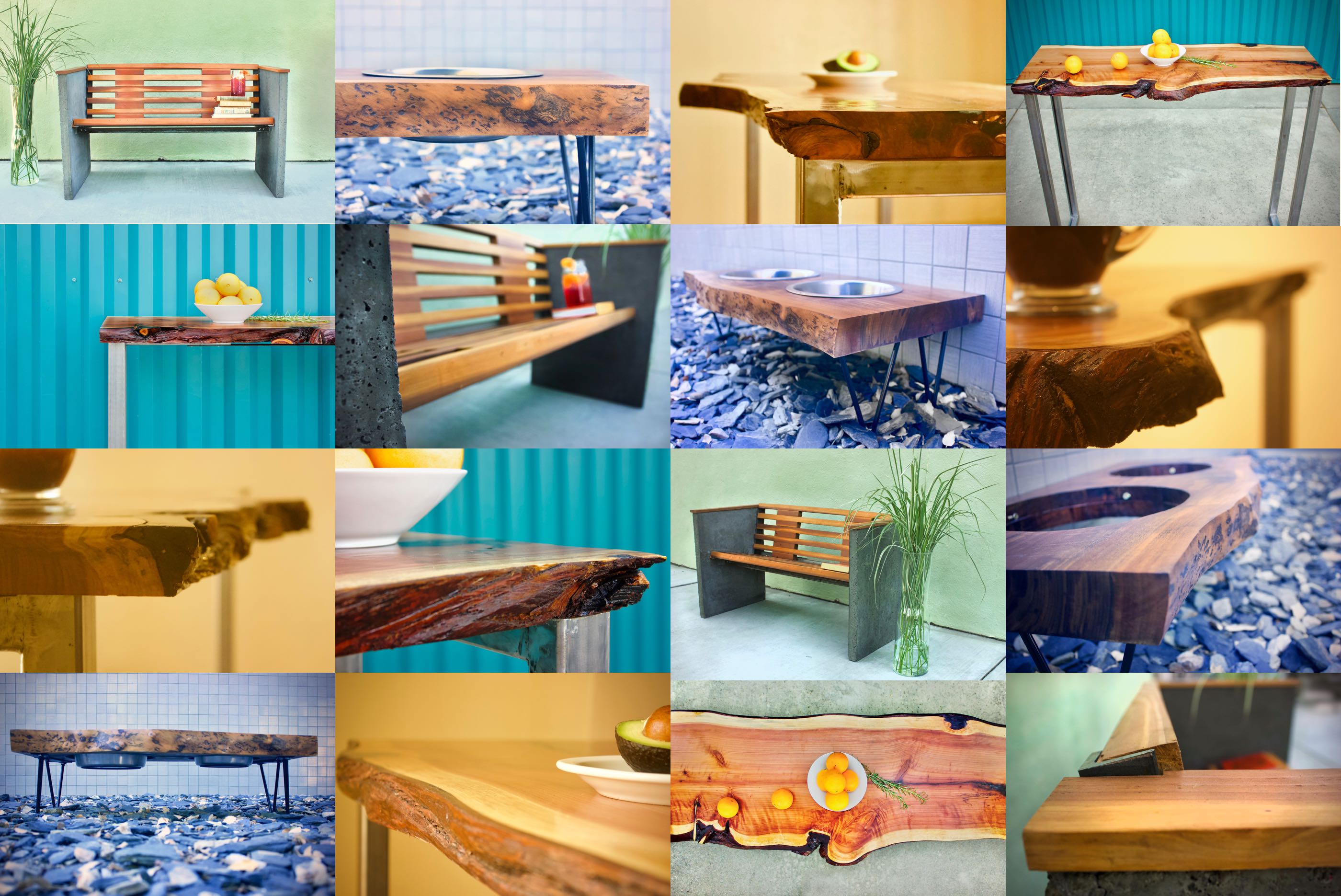
First rule of furniture photography staging: when in doubt, put some fruit on it.
Executing the concept was indeed a lot of work, but also a shocking amount of fun. I spent the next couple weeks finding every brightly colored abandoned factory and warehouse in Sacramento, and obsessively cataloging them in my phone. Laura contributed immeasurably with a flood of ideas for staging, and most of the props. Multiple tear downs, transports, and set ups of the larger pieces once again highlighted Elliott's thoughtful engineering, though I did quickly learn that enthusiasm for remote location shooting should be at least somewhat tempered by the amount of concrete present in your subject.
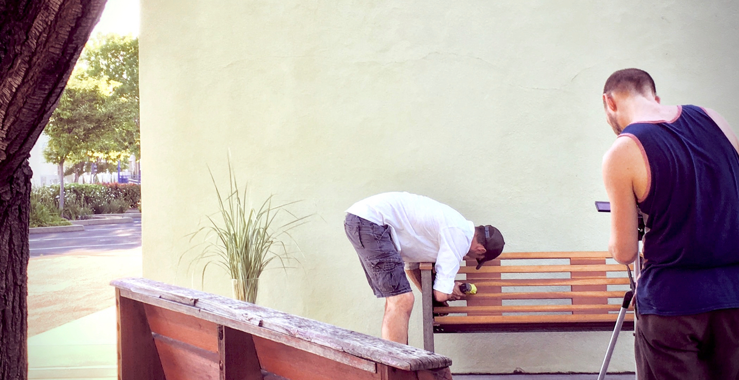
From there we did the shoots, which were probably... mostly legal? At any rate, every time I was certain someone was approaching to summarily kick us off the premises, they instead simply cooed at the furniture. I guess people like it when one sets up a pleasing interior-decorator-scape in semi-public outdoor spaces. Maybe this is that "guerilla marketing" the kids are so wild about.
I quickly learned that enthusiasm for remote location shooting should be tempered by the amount of concrete present in the piece of furniture.
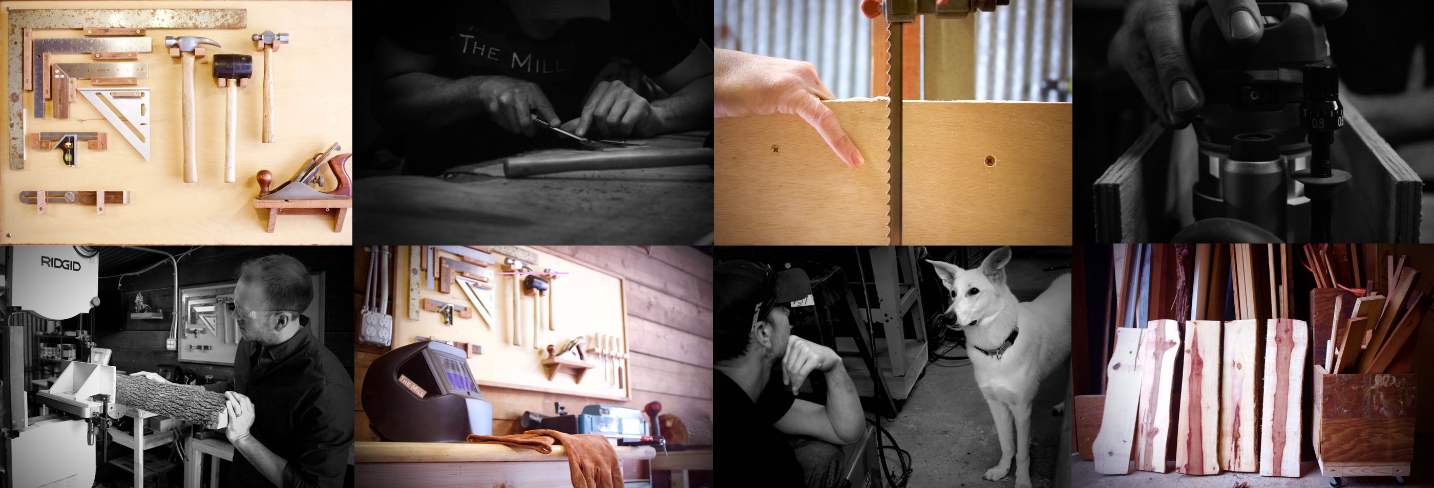
While filming the video that would end up on the homepage, I took some stills without knowing what their purpose would be. Elliott's shop at the time was simply a neighbor's unused woodshed, which Elliott had quickly overhauled into an effective and beautiful place of work. I tried to capture candids of him working, and small details of the place that made it unique. Eventually, we discovered they worked great together as a collage on the site's about page.
Elliott's work affected my own life in such a deeply personal way, and it was a unique joy to be able to insert that experience as the bedrock for the online platform connecting his work to the wider world.
For me — if I may be so bold as to call myself a "web artisan" — it reaffirmed that the quality of my craft is driven foremost by my ability to know my clients. Building effective platforms begins with having a ground-level understanding of who the folks we work for really are as human beings, what they are really setting out to do, and what value they are actually providing in the daily lives of their customers. The more first-hand this knowledge can be, the better.
Also, it doesn't hurt to have a life partner with better taste than you.