Margaret Welty Art
Helping an artist to change how we think about drawing and empower us to create original art without fear.
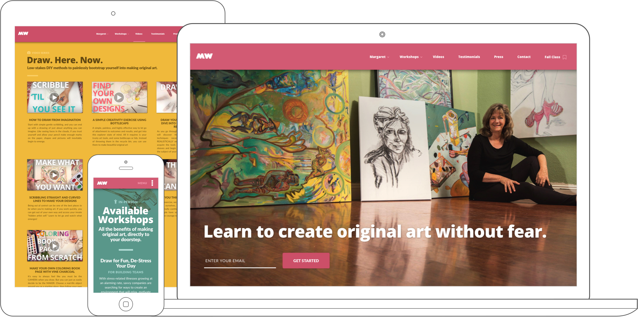
Margaret Welty has long imagined a different world. Growing up in California as a natural and passionate visual artist, she quickly developed a successful career as both a painter / sculptor and a college educator. To her, the profound benefits of artistic creation were self-evident and always accessible.
Yet, as she waded deeper into the educational side of her career, she found these benefits to be not only unknown to the general public, but actively restricted — in our society, only "Capital A Artistes" were allowed to make art. To Margaret, this was heartbreaking, and since then she has made it her life’s mission to dissolve these barriers, and help usher in a world where everyday folks draw, paint, and express themselves through art as freely as they speak, write, and converse.
When I first encountered Margaret, she was an enthusiastic and loquacious individual full of budding versions of these ideas, but without a clear sense of how to convert them into a cohesive and effective platform. I worked with her distill and clarify her brand, churn out a bunch of foundational materials and assets, and build up a central platform from which to engage it all with the world.

Hub Website
Margaret had her hands in a lot of endeavors.
Among other things, she was presenting at national and regional art educator's conferences, creating tutorial videos for online students across the world, teaching in sought-after college classes, doing radio and podcast interviews, and creating new art work. She had a number of small websites already, each attending to one of these pieces.
Though I understood the intention behind this approach, I observed that in practice it 1) was too much for her to maintain and keep track of, and 2) created confusion and cloudiness around the core ideas that she wanted to deliver to the world. If someone wanted to know what she was "all about," it wasn't clear where to send them. When she did an interview, it wasn't clear which URL to promote.
It seemed to me if we could unify all these things under one digital roof, that would give her the firm ground upon which she could begin truly expanding her reach.
The Pain (and Power) of Priorities
One of my favorite parts of building a hub website is that it forces you — often through highly gritted teeth — to define and prioritize the key aspects of both your brand and your business objectives. After a lengthy brainstorm, Margaret settled on her three most important goals in the next two to three years:
- Build a list of folks who resonate with her content and ideas
- Get more folks watching her tutorial videos
- Book more in-person workshops
These principles helped immensely to guide me towards clear, punchy headlines and messaging, and site flows that were always lightly carrying users towards one of our three desired actions.
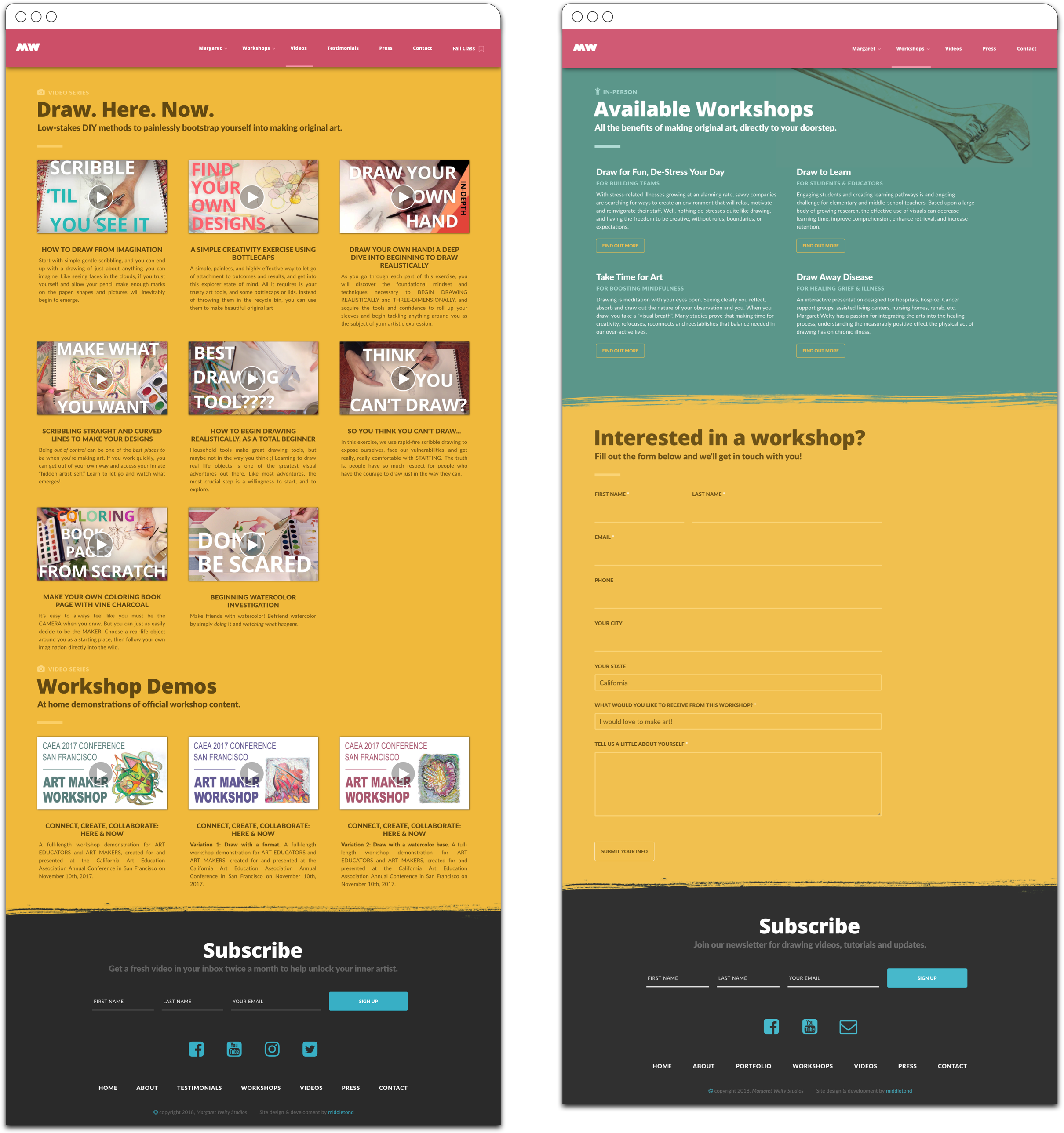
Design Principles & Aesthetics
In her tutorial videos, Margaret would speak in a stream-of-consciousness flow, creating simple, almost child-like practices out of fine art techniques that would otherwise seem erudite and unattainably lofty. Drawing became less a rigorous craft, and more a therapy, a release, a meditation. She would take her viewers back to how they felt about making art when they were young: as an act of curiosity, wonder, and exploration.
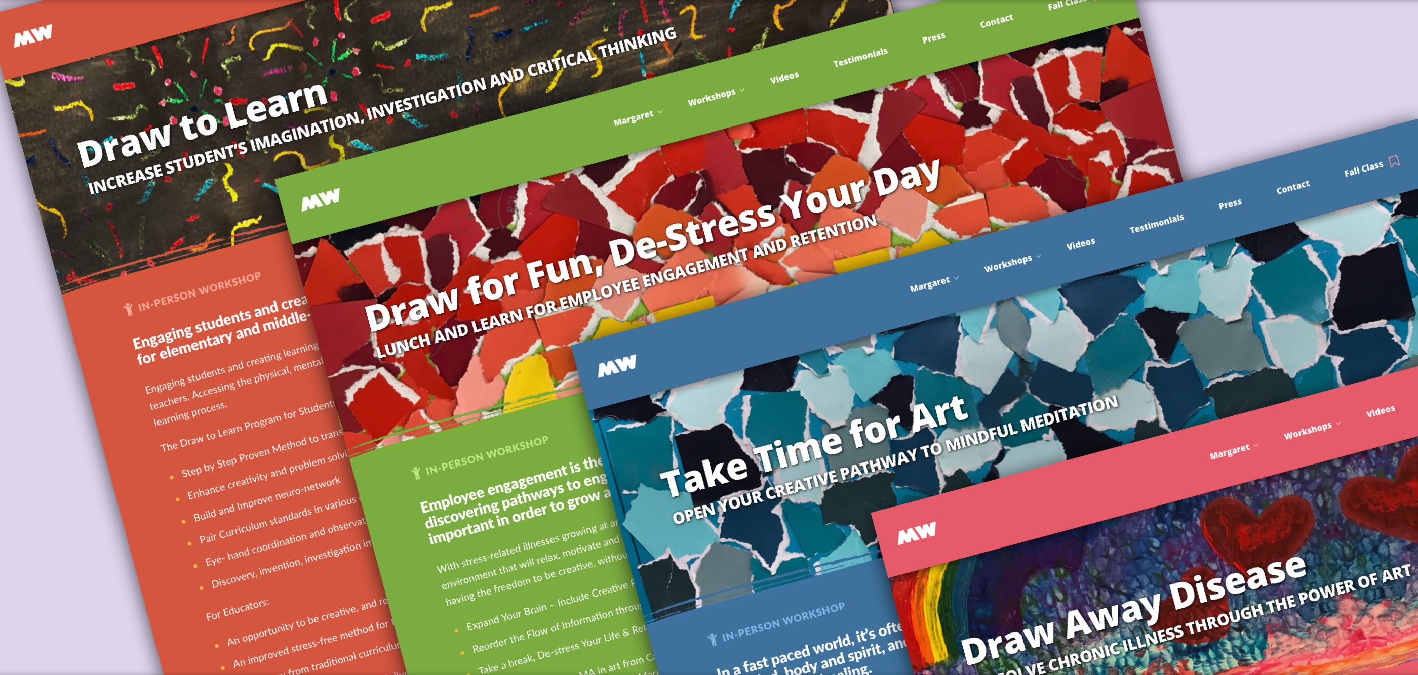
It felt crucial to me to infuse these qualities deeply into her site and brand. At the same time, everything needed to retain a sense of authority and intended for a savvy, working adult audience. To achieve this, I started with bold, blocky colors and smatters of DIY line drawings and collages lifted from her tutorials, then contained it with tight, economic verbiage and generous whitespace.
My aim was for the site felt concise and professional, but also full of joy and playfulness.
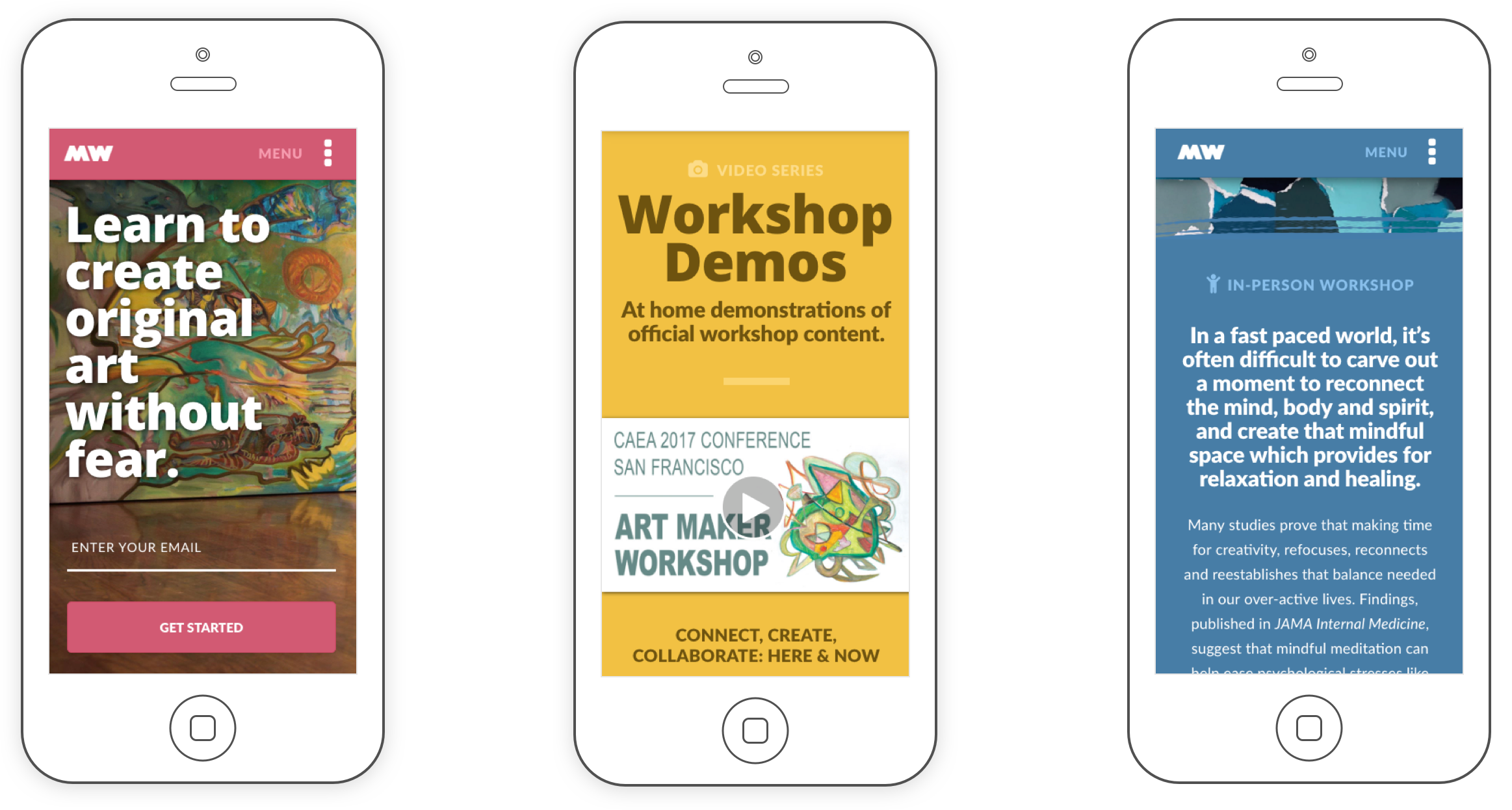
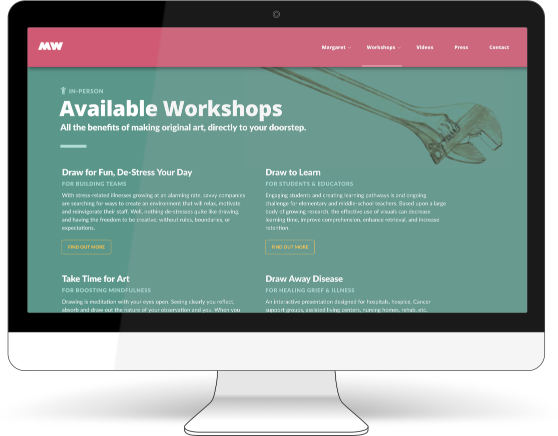
Workshops
Margaret's methodologies, tools, and ideas about learning art had long been applicable to a much wider demographic than just college students. While her college classes were one of her core passions, she really wanted to move beyond the administrative and geographic confines of the institution she worked for, and begin delivering curriculums in person for other groups.
Because of her passion for the subject, Margaret had an infectious energy and an innate gift for speaking extemporaneously for almost any length of time when she began teaching. My sense was she would be a natural at presenting art workshops in almost any environment to almost any crowd. I felt she would love delivering them, and her attendees would immediately love her dynamism and enthusiasm.
So, in early 2017 we began developing workshop ideas to put out there and see what happened.
Margaret also applied for more formalized presentation spots at the annual Art Education Association conferences in San Francisco and Seattle. To our great excitement, she was accepted to both!
Over the next months, I worked with Margaret to help create, develop, and polish each workshop. Unlike our independent workshops, these presentations had defined parameters with a more traditional academic bent. For the national workshop in Seattle, we created Art + Math: Using Measurements to Map Your Own Face, which taught attendees to harness the scientific method and fun household items to better understand and draw the human face with accurate proportions. Once it was properly organized, I created a printed version to hand out to attendees.
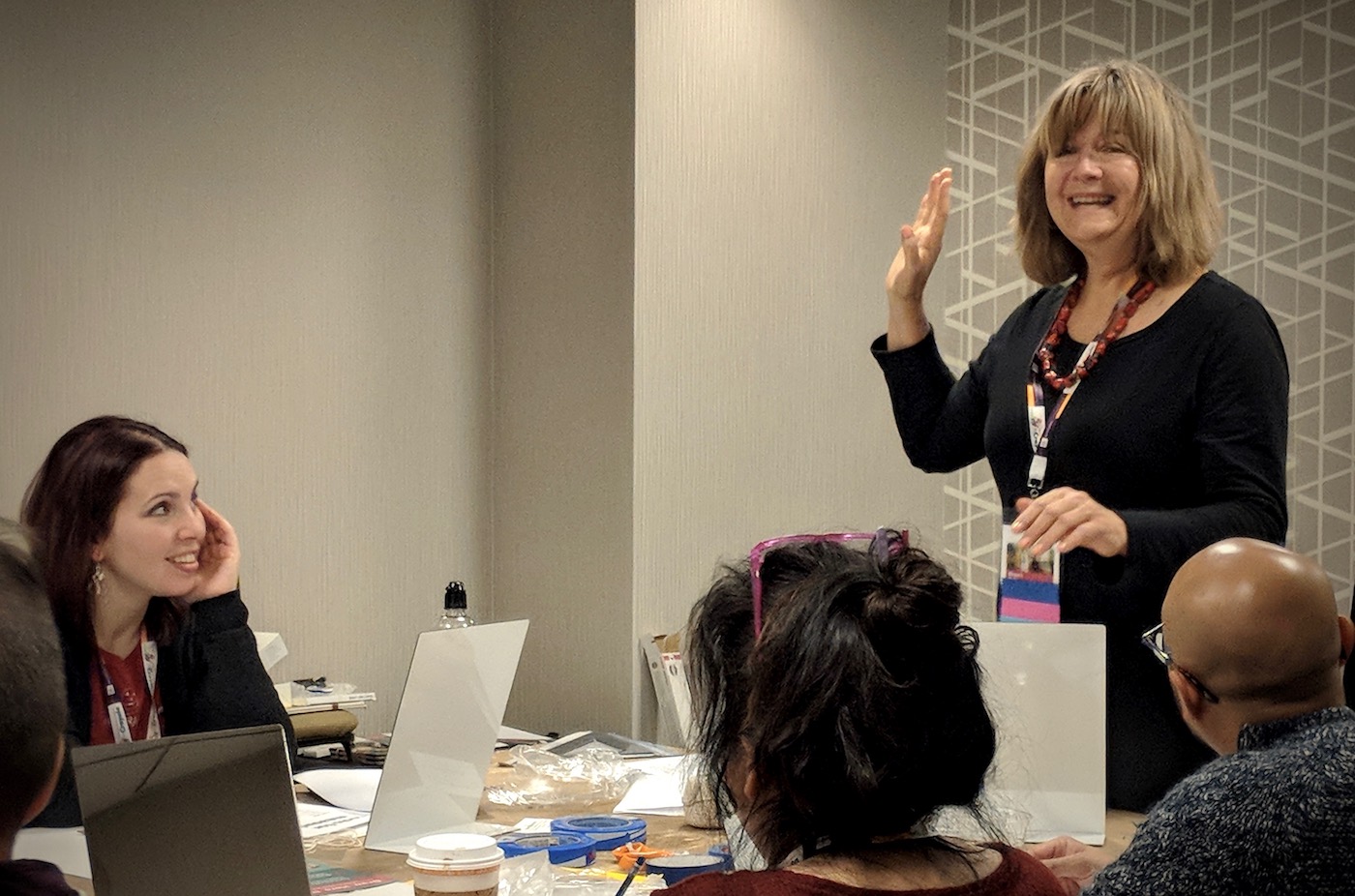
Margaret spreading the fun per usual. 2018 National Art Educators Association workshop in Seattle.
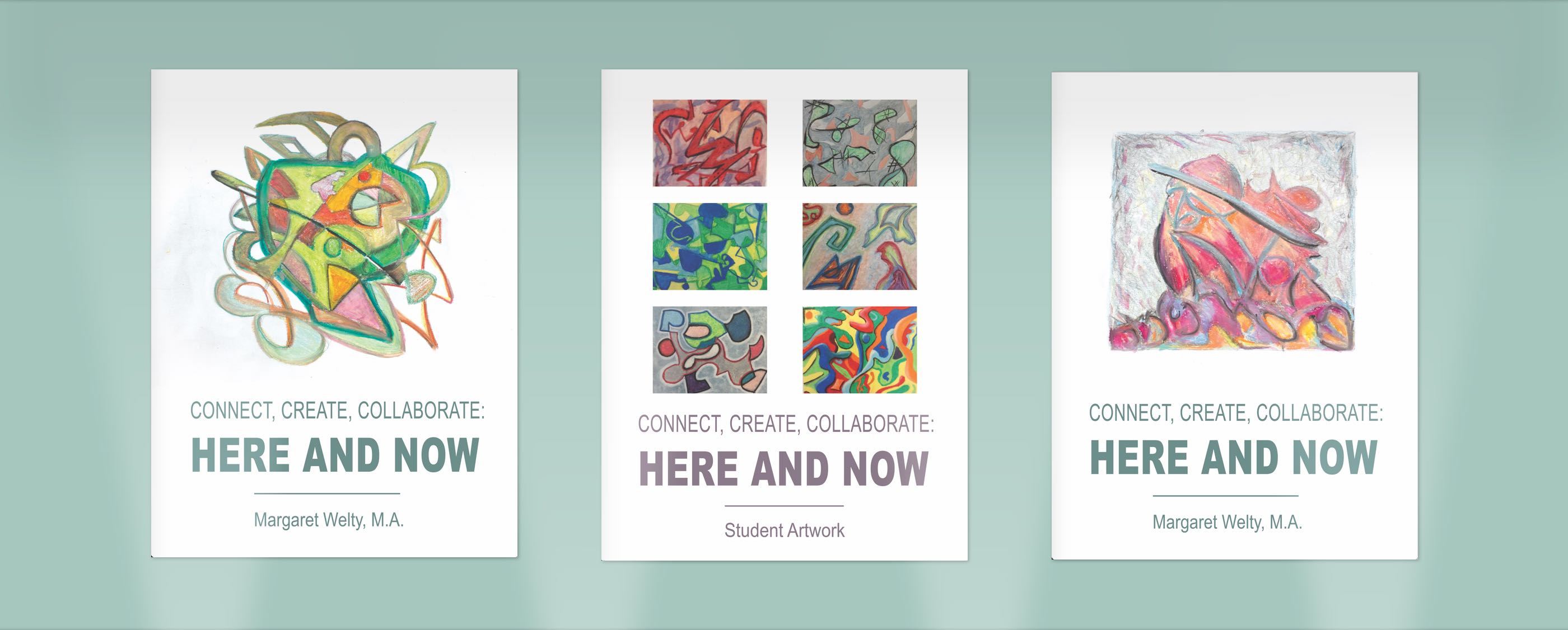
The state-level workshop in the Bay Area was more broadly themed, so we took a different approach. We filmed repeated passes of Margaret improvising a lesson (creating low-stakes abstract art with colored pencils to freely explore the classical elements of design), then reviewed the footage and assembled a presentation from the best moments in all of them. As a bonus, we found that the abstract drawings she had made during the video passes worked really well as posters to hang in the presentation room.
The feedback from workshop attendees was very encouraging, and emboldened Margaret to continue pursuing opportunities to deliver her material. Since that time she has begun to deliver fully independent workshops across a wide spectrum of demographics.
Press & Advertising
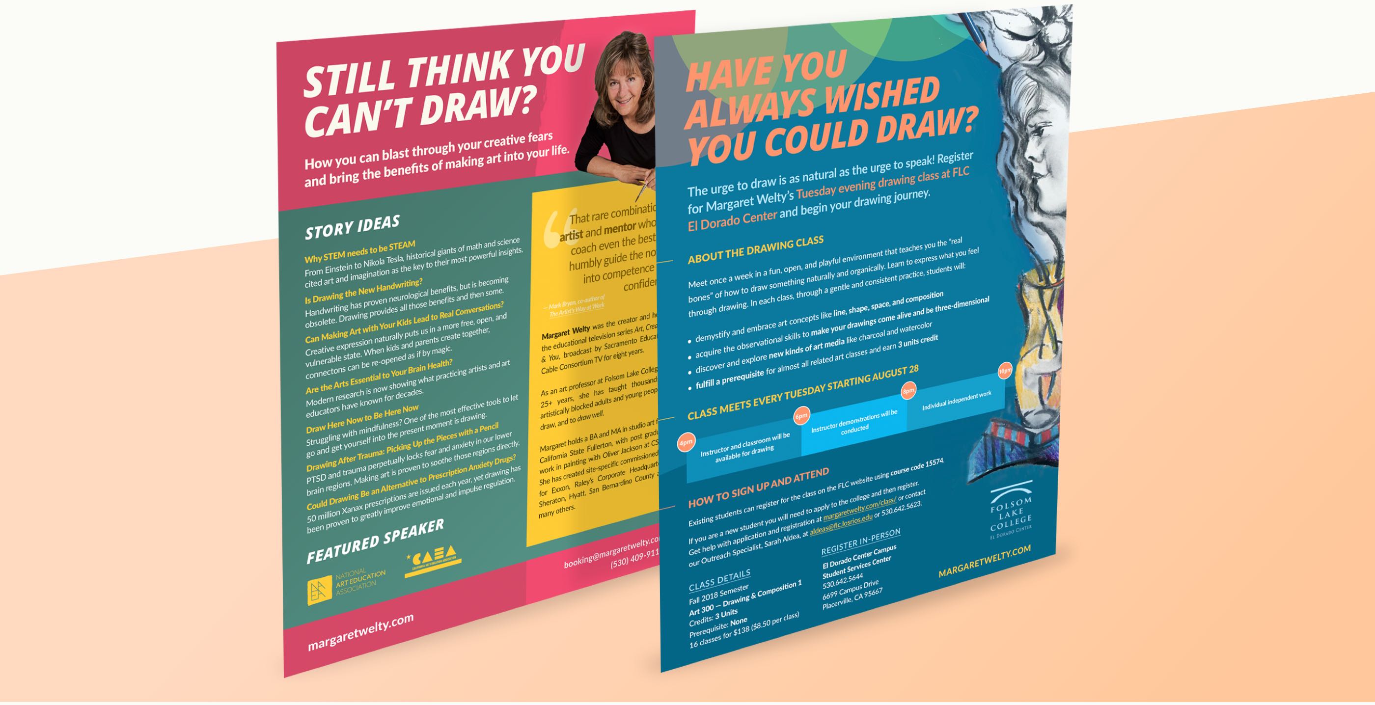
I worked with Margaret on two P.R.-related print projects. The first was to create a concise one-sheet to give to folks at a press summit she was attending in New York City. The second was to create a promotional poster for her college class in beginning drawing, with the goal of pulling in fresh demographics from outside the institution.
Press Summit
For the press one sheet, the central challenge was to create a list of viable story ideas, complete with proper headlines and taglines. While Margaret already had a number of well-worn talking points from decades of teaching and speaking about art, but we both felt it was crucial to only make story claims that were backed up by the latest scientific literature.
I served as "research arm" of the project, gathering and reviewing all the recent studies I could find, and pulling out trends and patterns. In the end, we were pleasantly surprised to discover many of the findings from the data matched or exceeded Margaret's own conclusions from personal experience (this study on 400 fifth graders where regular art making was found to increase resilience in the face of failure and uncertainty was one of my favorites). Once we had this, we were able to confidently create strong headlines and talking points that we knew were evidence-based.
Class Promotion
The challenge for the promotional poster, on the other hand, was a classic design problem — how to convey too much information in too little space and keep everything feeling clean and simple. Margaret's classes often had outside interest from non-students (one student actually drove two-hours each way from Reno in order to attend her class in person this last semester), but the steps required by the college in order to attend were fairly obscure, and not listed in any one place on the institution's website.
After trying and failing spectacularly to organize all the steps and cram them into the poster space, it occurred to me we could just make a page on Margaret's site that led students step-by-step through the process, then link to it on the poster. This worked infinitely better, not only giving us space to keep our poster clear and pretty, but also providing a canonical resource to any student needing a helping hand through registration.