The Hidden Table
Once upon a time, a husband and wife ditched their day jobs and steadily built a peerless farm-to-fork catering company.
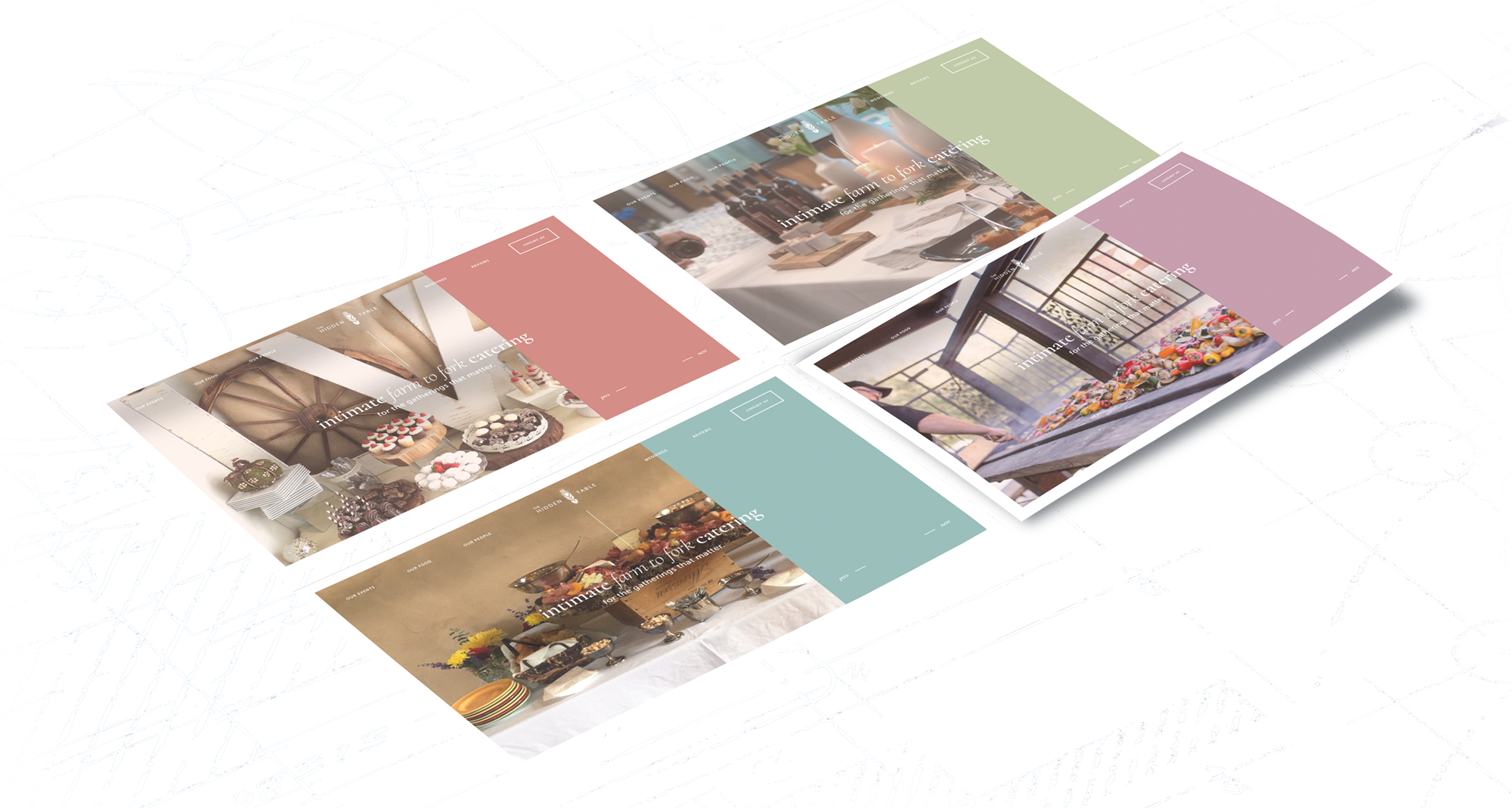
It was my job to get their online brand to catch up with them.
Look, I get it: we live in a world overstuffed with superlatives. Now, with that out of the way, let me tell you about one of the most amazing meals of my life.
It was approaching the holidays in Sacramento and I was at the home of Russ and Linda Landers, owners of the Hidden Table, a fast-rising, local, farm-to-fork catering company. I'm at their house this evening because once a month, Russ and Linda prepare and serve a meal—called a "private tasting"—in their own dining room for prospective new customers. This particular gathering consisted of about a dozen people. Most were young couples flushed from recent engagement, along with the occasional parent, and the rest were some nice university folks from UC Davis.
Oh, and also: me. Russ and Linda had signed with me that day to perform a website and brand overhaul, and Russ had graciously invited me to a tasting so that I could, ahem, do brand research.
Though they had just become official clients, I had first met Russ several years prior, when the company was just pushing off the ground. Since then, much had transpired. He and Linda married, she had ditched a 20-year corporate career and signed on as CEO, and the company had steadily expanded based on effusive word of mouth. More recently, this expansion had substantially picked up speed. Russ and Linda were elated about the growth spurt, but were also holding on for dear life.
Arriving at their home, I found Russ’ demeanor identical to when I met him. An Oklahoma native, his quick wit was tempered by a midwesterner's easy, warm directness. He used the word "blessed" often, and without irony. He explained things using baseball metaphors. He made you feel part of his team. It would take a serious act of will not to like him immediately.
A Web Designer's Guide to Amazing Free Food
As I had no dog in the upcoming-event race, my presence became an object of curiosity. I spent the pre-meal minutes attempting to explain away my imposter syndrome feelings to the other guests. You are here because you're going to re-design a website? Why exactly is eating the food necessary for such a thing? I did my best to champion the pricelessness of first-hand personal experience with your clients’ craft, but I think most of them concluded I was simply a culinary freeloader.
Well, perhaps I was. As Russ and his team began dishing out entrees, it became apparent I had hit the culinary freeloader jackpot.
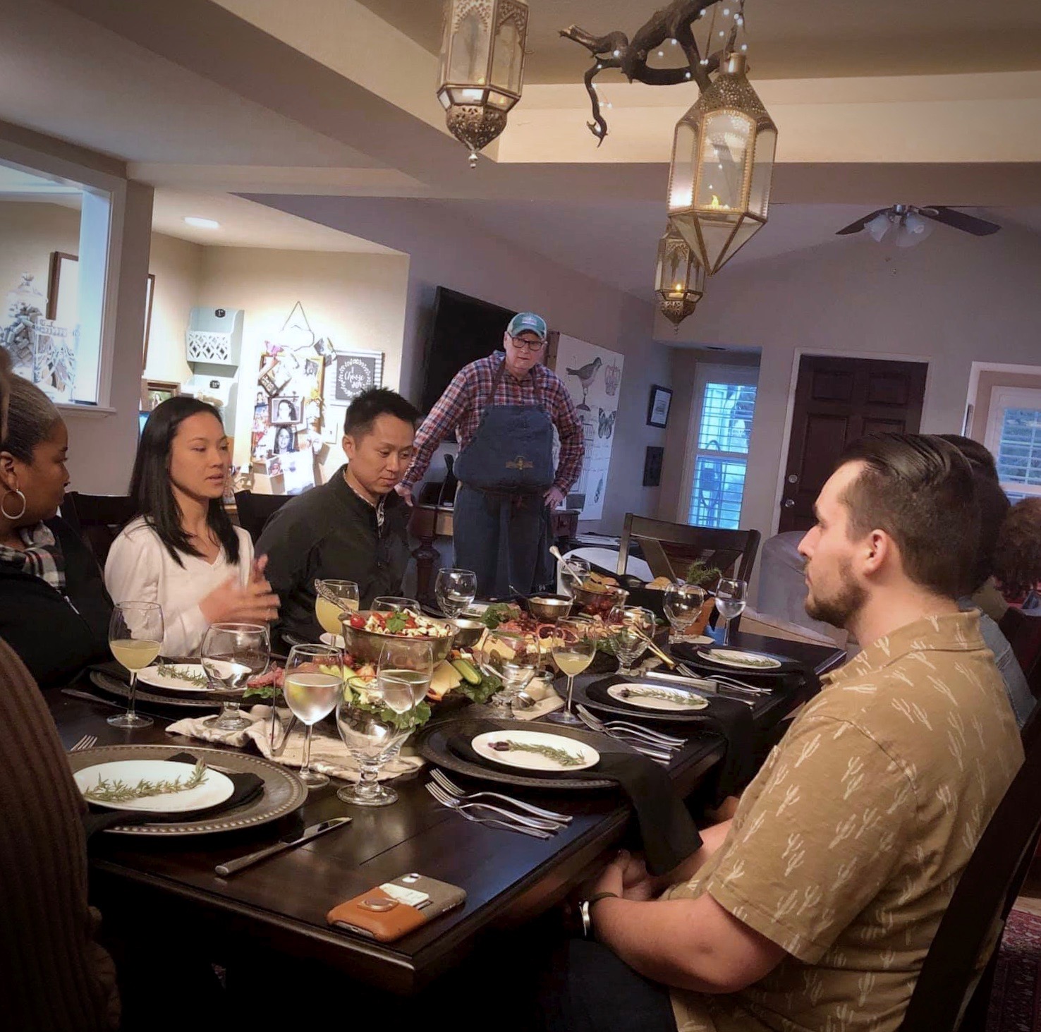
All signs point to deliciousness.
Chef Russ + guests wind up for a Hidden Table private tasting.
I am not a food writer, so I'll spare you watching me struggle through descriptions. You can always ogle Russ's dishes yourself. There are, though, a couple things about the experience that I think I can depict successfully.
First, this was not a restaurant meal, per se. It was more akin to a home-cooked meal. But like, a really, really good home-cooked meal made by your favorite uncle who happens to be a badass five-star chef. There is some dining that makes you stress over whether you're sitting up straight enough, or pronouncing the choices correctly, or if the other diners are secretly judging your attire. This was not that kind of dining. Eating this meal felt like coming home. It evoked words in me like nourishing, satisfying, fresh, rewarding. This is the food you would want to eat in your PJs after a long day surrounded by your closest loved ones. A full-tilt, no-holds-barred, rest-and-digest experience.
Second was the staff. Despite this being a normal dining room in a normal house, there was a palpable sense of service and humility that infused the room, and it was because of them. Their body languages reminded me of the guards at the gates of Buckingham palace. They seemed to treat it more like delivering a sacrament than performing a job.
To consider that this is the experience the Hidden Table brought to gatherings of hundreds every week was striking. I left feeling moved, impressed, and inspired.
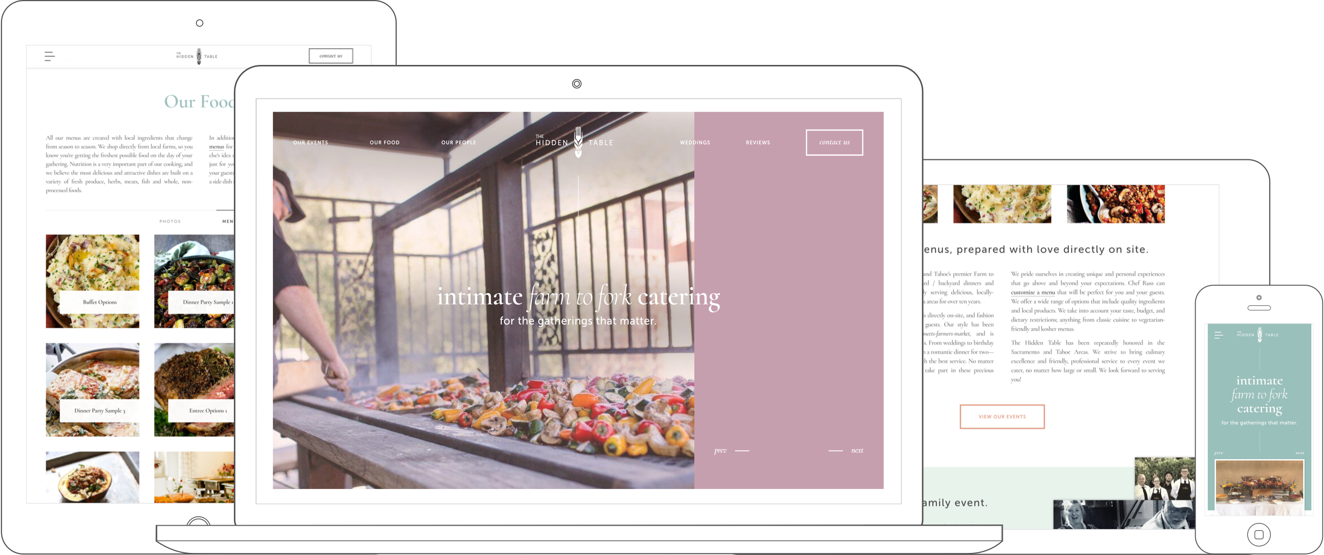
Brand Website
When it comes to online presence, entropy is often a brand's biggest enemy. Put more concretely: websites and social media look great at first launch, then break down over time into something non-functional and embarrassing.
One of the more diverting yet squirm-inducing pastimes as a web creative is to compare what web design agencies show in their portfolios with what the actual sites looks like today. The more in the past the re-design was, the more you can see how the real life site has decayed. Blog indexes become ghost towns. Sidebars become strange mazes of arbitrary 3rd-party widgets. Social media accounts become windswept valleys of one post a year with zero likes.
It can be hard to watch.
The Hidden Problem
It’s not rocket science why this happens. It's not because the designs were bad—it's because no one has the time. Digital content creation is an annoying monkey on the back of every business owner. Like transcendental meditation or calling your grandparents, it is just this thing you know you should do but don’t really know how to do and feel guilty and anxious over not doing enough. Where are you supposed to find time to write blog posts? And what the hell is a snapchat? Are agencies going to start insisting the only way to stay competitive in your market is to regularly post pics of yourself with anime eyes and fox ears?
Yet this is the deal. At root, digital agencies have the same pitch: "If you don't do this hot new online thing, your business will perish. Oh, you don’t have the bandwidth to do that? Ah, what a fortunate coincidence—we are actually total experts at doing this new thing! We can do it for you! Well, thank goodness we found you before it was too late."
Digital content creation is an annoying monkey on the back of every business owner.

For bigger businesses this is all fine. They have the resources, and—perhaps more importantly—the existing habits. They already have teams dedicated to concerns unrelated to their core competencies. They already have offices for accounting and legal; why not another for digital content?
But what about smaller businesses? Family-run businesses? This is a different model. For these folks, it is: live and breathe your core competency every waking hour, then somehow get to the other required stuff in the mostly non-existent spaces in between. There is no “digital content team” for these folks. Moreover, they don’t have the resources to hire a full-blown outside agency.
Of all the companies I have worked with, the Hidden Table were the most like this.
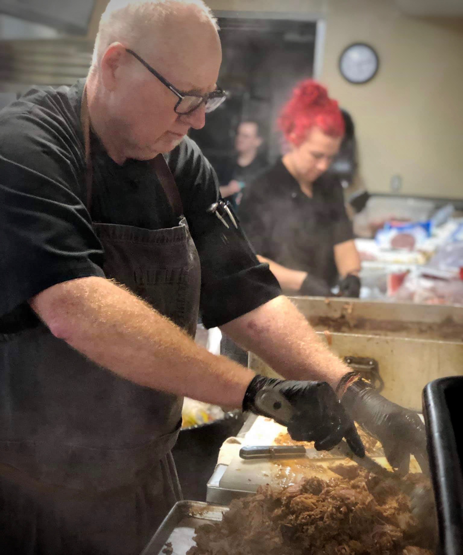
The focus required to fill 300 bellies.
Chef Russ and his team in action.
The Hidden Table's office is certainly a place of action. Whenever I meet with Russ and Linda, I always find them cartwheeling through what appear to be at least three crises in parallel. Here's a typical scene: Linda is both on the phone with a customer, and orchestrating her entire team. The tone of her voice in is constant oscillation. She looks up from the phone to address me with taciturn frankness, before switching on a dime to a personable warmth as she returns to helping her customer navigate the touchy logistics of successfully feeding her wedding reception's 250 guests. Russ, meanwhile, has a phone wedged to his ear while he types on two laptops, and occasionally barks orders like a field commander. Their staff is in the back, careening everywhere like balls in an 80's pinball machine. There are a lot of ingredients flying around. There is also lots of running and shouting, in general. If enemy troops suddenly barged in and shells started exploding around us, it wouldn’t have felt all that weird.
It was clear to me that the Hidden Table were deadly serious about their work. It was also clear that asking these guys to maintain their own online content would be clinically insane. If ever there was an online ghost town waiting to happen, it was here.
Automated Content Machine
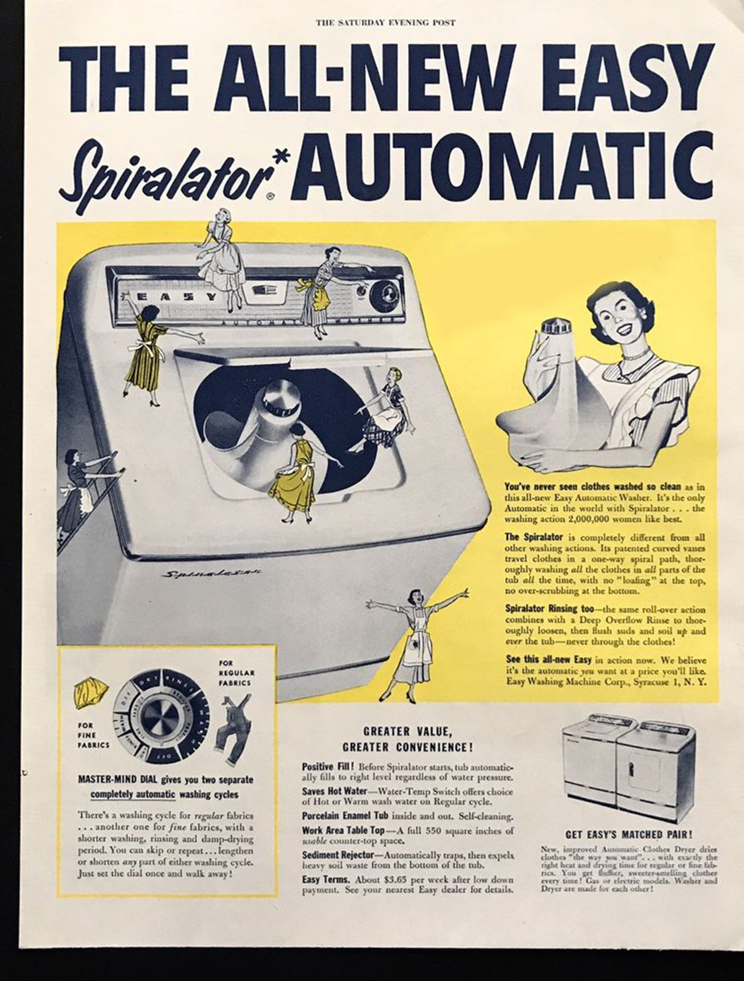
Okay. So. How do you make a fresh, lively web presence for folks that are living in perpetual redline each and every day? I could see the writing on the wall with the traditional agency "built you an awesome web presence" package: at launch time everything rolls out with shiny, up-to-date content, then one year later it looks like a Detroit automobile factory.
That said, the Hidden Table did do this one online thing: every time they served food at an event, their staff snapped pictures. Afterward, they posted them to the company's Facebook page. They didn’t do any other social media, but they did do this.
This tiny behavior became the seed for all my plans.
These photos were unstaged, often low-resolution, and taken by hardscrabble caterers, not photographers—taken individually, it would be rare to find one that would seem appropriate for a glossy brand website. But viewed in their aggregate, they conveyed a remarkably rich, 100% organic portrait of what Russ, Linda, and their staff actually do.
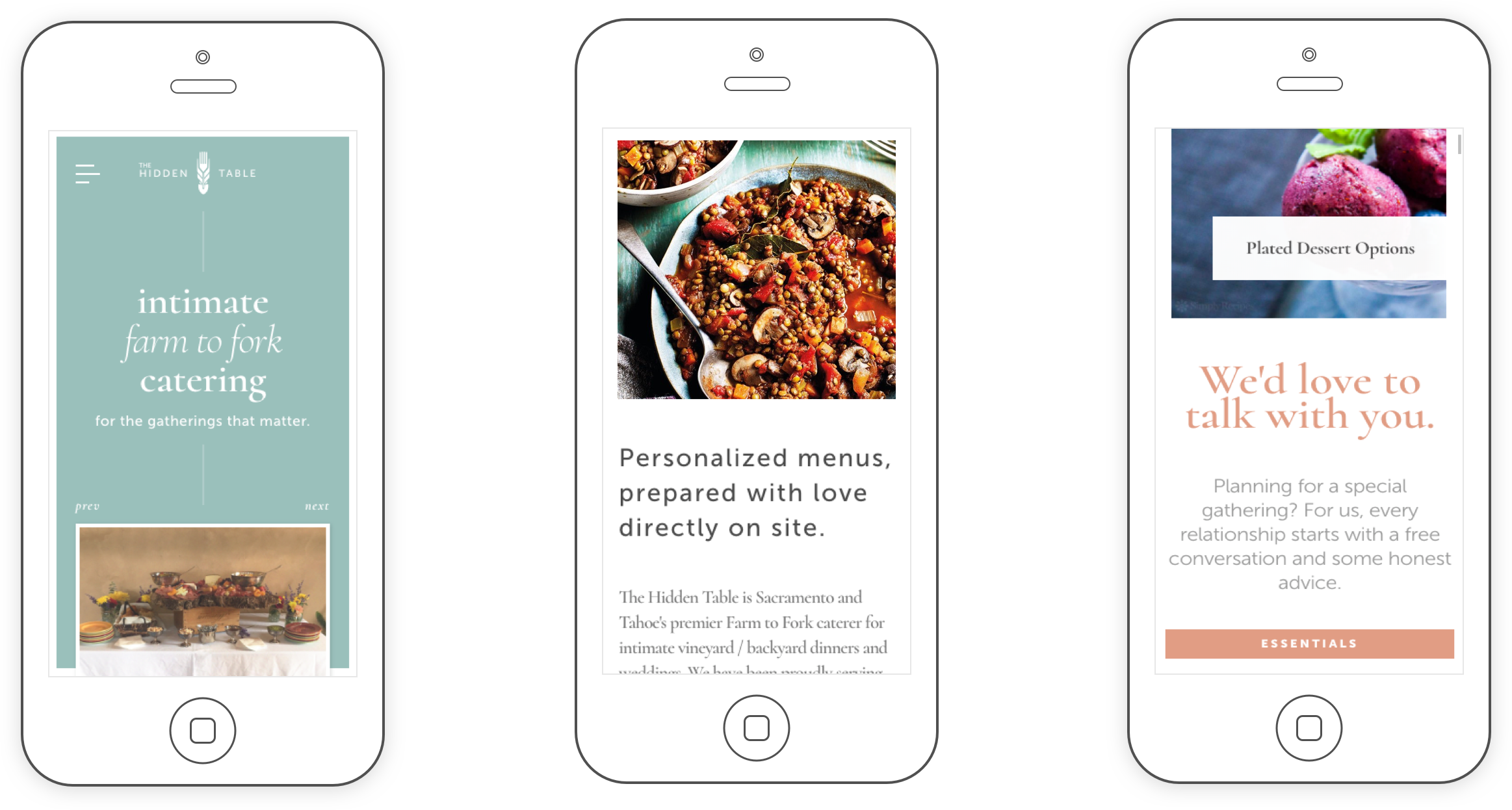
With the right presentation, I felt these loose bundles of candid shots could tell the Hidden Table's story with more clarity and emotional impact than any set of glossy, staged, close-up photos of food ever could.
Using All Parts of the Animal
Between event photos and customer reviews, it seemed to me the Hidden Table's presence on Facebook could fuel close to the entirety of their website content. And it could do so in a way that would be more compelling and more authentic than any kind of staged or curated thing. This was literally them, in real time.
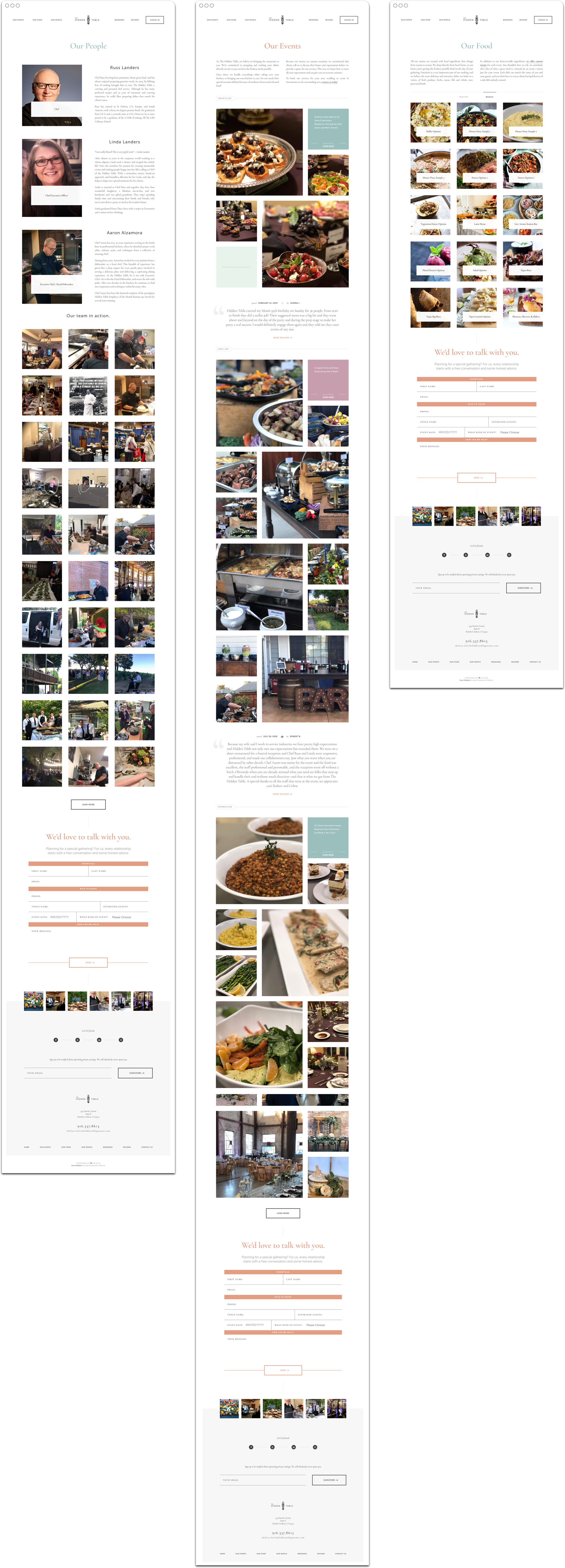
We could have an events page which would group and display photos by event, along with the date, location, and Russ’ in-the-moment comment from his original post. We could also separate out the photos from events, tag them as either people or food, and have both food and people (e.g. their staff) pages full of authentic images. It would be a clean historical record of all of their professional activity, told as visual stories.
We could also power a reviews page using with the latest customer posts from both Facebook and Yelp, sorted by most recent.
Social content wasn't just going to support the website. It was going to be the website.
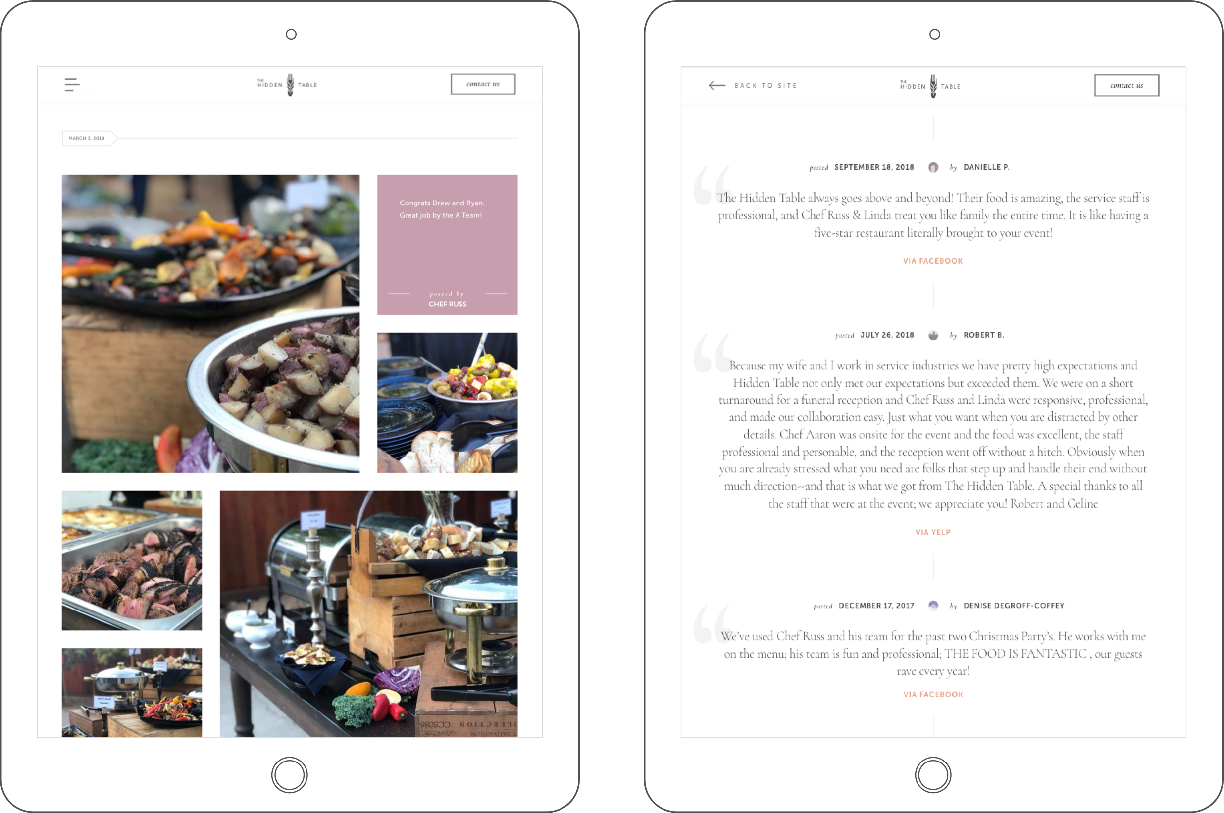
Okay, so this is all very good. But how do we do this? A key factor here is that this content plan would only work with the right presentation. This means no little embed widgets or something equally tacky. We weren’t going to put like a plucky little facebook post feed in the sidebar or the footer or something.
Social content wasn't going to support the website; it was going to be the website.
The Technical Bits: APIs vs. Web Scraping
I'm going to speak in geek language for a bit here. Feel free to skip this section if you feel your eyes glazing over.
To make this happen, the developers among you may have assumed the use of Yelp's and Facebook's official APIs. This would be quite reasonable of you. This is certainly my preferred way to pull in content. Unfortunately, API's often have enforced limits. And hey, we like limits. Limits are good for humankind. Humans need structure and boundaries. That said, sometimes limits can be real dealbreaker sonsabitches.
First there's Yelp. Yelp’s API only returns the first three reviews for a given business, and on top of that gives them to you in some sort of "Yelp secret sauce" ordering. Of course, we wanted all the Yelp reviews, ordered by most recent. Hmph.
Okay, what about Facebook? Facebook’s API limits were more subtle, but also more maddening. Facebook would only allow substantive API access to a business page if the requestor was logged in. Moreover, they go to great lengths to make sure that only human beings can log in. Okay, that's sensible. No bots. Except... for this project, I needed a bot. A bot made the most sense, both for us and for Facebook. The bot would pull Facebook content once a day into a backend and store it in a database. Then, the Hidden Table website could query that. Otherwise, the site would we forced to constantly bother Facebook for the same data every time it got a new visitor.
Doesn't that seem like the polite, sensible approach? Yet Facebook did not agree. Yeesh.
So now what? Frustrated failure? Not quite. Fortunately, there is web scraping.
Ah, web scraping. That shady, cigarette-smoking cousin of the well-documented API. Nothing makes you feel like an web developer vigilante quite so much as programmatically scraping content from mungy HTML.
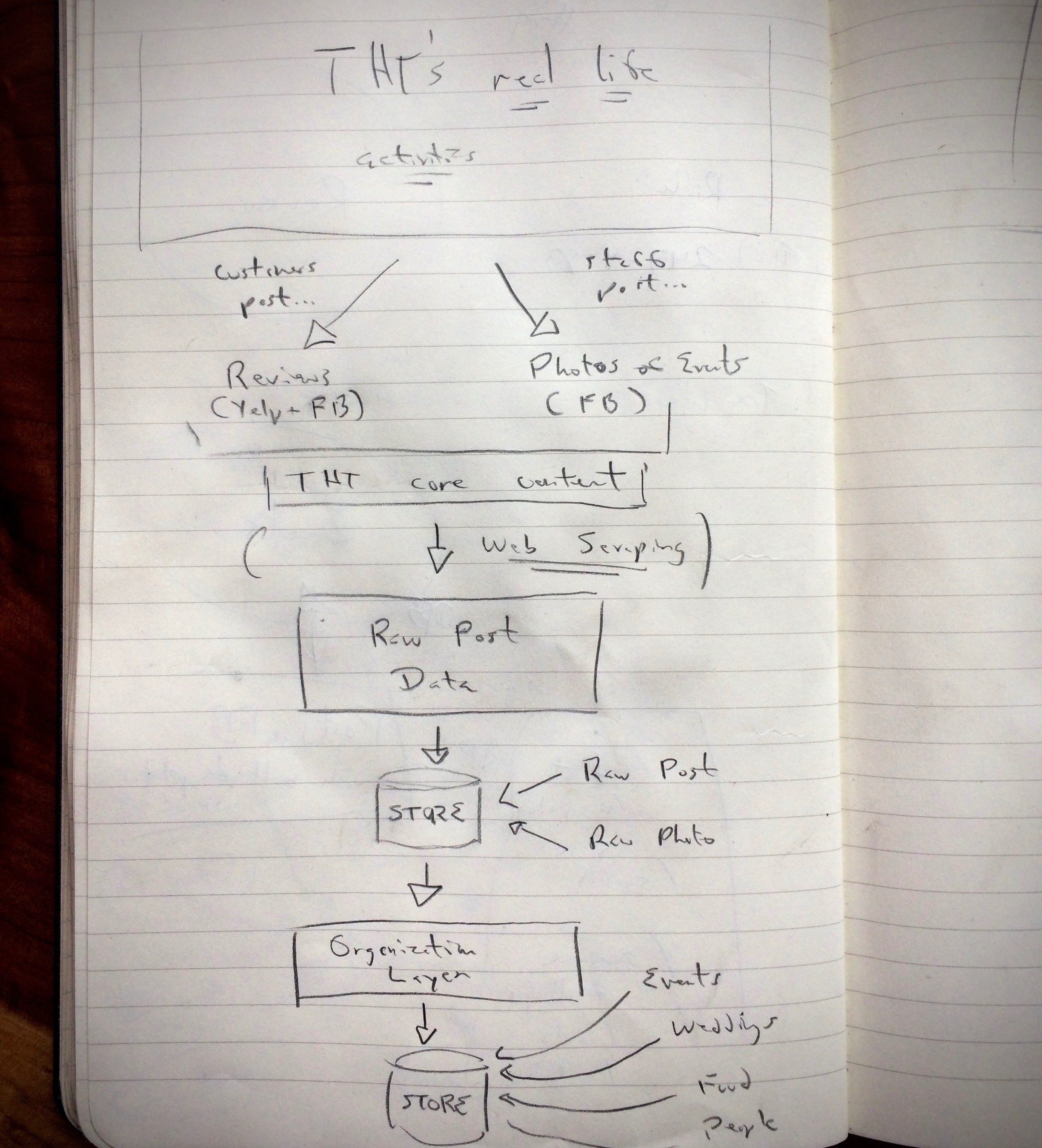
The automated content machine
version zero:
I think web scraping gets a bad rap. I was in a civic data tech startup and I headed up data ingestion for a couple years. Day in and out, our job was to pull official records out of government websites, by hook or by crook. We did a lot of API work, but we did even more scraping.
As the data sources piled up, I noticed that on average the API-driven sources went awry significantly more often than the web scraping ones. I found this both astonishing and counterintuitive—many of these government sites looked like they were built in 1997, with decaying, brittle markup to match. Yet, it continued to be so, even beyond the scope of the startup.
That said, I had never before scraped social media. Would it be different? I mean I'm sure Yelp was fine, but Facebook? The general buzz on the internet was that Facebook was a fire-breathing dragon when it came to scraping attempts. Still, I was fairly confident I could build a working system today. But I was quite concerned about it continuing to work over the next few years. Especially the ever-shifting code-and-policy monster that is Facebook. But hey, history was on my side.
Assembling the Machine
The Yelp side of things was straightforward. Yelp's business reviews page is by the book—semantic HTML, no javascript rendering. I have a de novo scraping library that I've steadily whittled down to the essentials, so there was little infrastructure to set up. If a web page is well-structured, I can be pulling in the desired data in minutes.
Facebook was, of course, not that. Facebook's pages were an opaque jungle of shifting, javascript-rendered, hyper-nested elements. Most of this was surmountable with the right tools—the javascript can be handled with a headless browser, and the dense nesting with some well-placed pharmacological stimulants—but the shifting thing was a real problem. Every time you reloaded the page, the structure, ids, and class names changed. This was perhaps solvable in theory, but solvable in the time budget allotted for a marketing website for a local catering company? Not so much.
Fortunately, like any Achilles-like figure, Facebook had a heel. Err, actually more like an progessive, beneficial service to the developing world. But for our purposes, also a heel.
In 2011, Facebook had deployed a service called Mobile Basic. The service aimed to shrink the global accessibility gap to social media by delivering core Facebook pages to the most rudimentary of cellphones. As such, these pages were delivered in blissfully semantic, javacript-free HTML.
I was, as one might expect, quite happy to discover Facebook Mobile Basic. I get that Facebook is an infamous, all-devouring, mega-corporation stealing all our data, but I also really liked the idea. I felt it was a great way to approach accessibility for any large tech platform—rather than try to make your product do everything for everyone, build an entirely separate, low-res, no-frills product that you almost never have to worry about or retool.
And OH HEY: it also allowed Facebook business page data to be painlessly scraped.
I was philosophically aligned to both of these new facts.
The ability to scrape the canonical public Facebook activity of a business seemed like it might be useful generally, so I decided to abstract the concept. I created a module that accepts a Facebook business page URL, and returns the entirety of posts, reviews, and photos for that business as structured JSON data. From there, I set up an ongoing social media content pipeline for the Hidden Table ending in a permanent data store, and an API service on top.
This was a bit laborious in the short term, but the approach had some serious long-term benefits:
- The client owns the core front-facing content of their business. No matter what happens to social media in the future, the Hidden Table retains a complete and easy-to-access library of all posts, reviews, and photos—the essence of who they are online.
- The client's content isn't bound to their website. They can change platforms, redesign the site and / or have multiple sites, all without the labor and stress having to re-architect, transfer, and translate content.
- The client doesn't have to manually update anything. Pertinent new content appears automatically on their website. Their site never becomes a ghost town. Their online footprint is consistently relevant. They can focus on what they do best.
- The client's website doesn't need an admin area. We can build the website without being limited to platforms with a built-in, client-friendly admin. This means we can build lightning-fast, performant pages using with something like Jekyll instead of something slow and potentially bloated like Wordpress.
Some pages fed daily by the Hidden Table's automated content machine.
The rules:
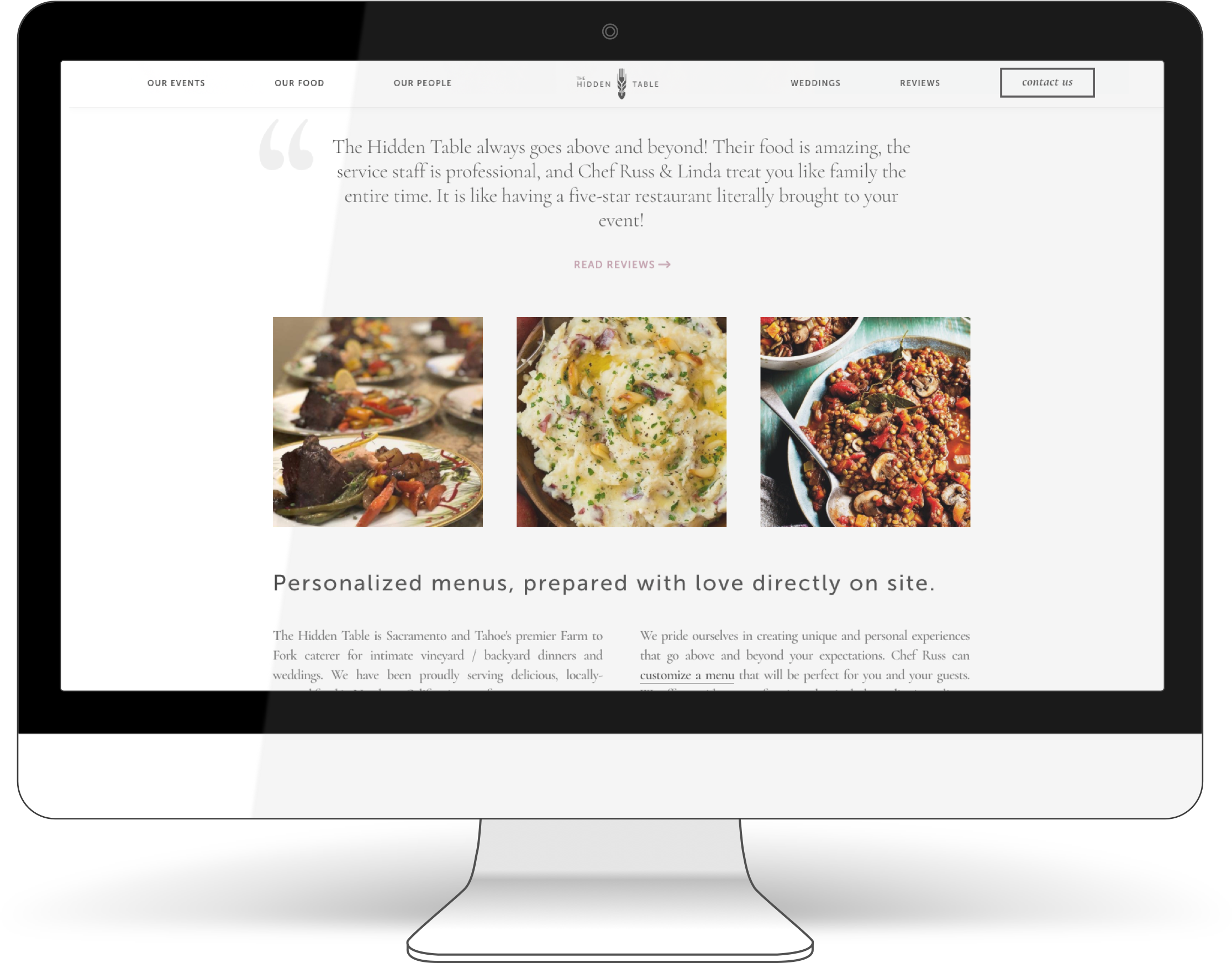
Make it feel like instagram.
Make it feel like a print magazine.
No stock photography allowed.
Design & Branding
I want to talk about design, which means I first need talk about market research. In my world, the former doesn't exist without the latter.
Digging into the catering market space yielded some initial surprises. The vast majority of companies I looked at—both local and national—had this vaguely razzle-dazzle undertone to their branding. Everything felt a little too much like bow-ties and cummerbunds; like there was a veneer between the craftspeople and the customers. Like it was Las Vegas in the 90's. Moreover, this veneer was being upsold.
My first-hand experience with the Hidden Table made it clear that they were all about removing this separation. Their goal was to bring the experience as near to being an actual family meal as possible. To me this was the right idea. They were pushing things towards the human, the handcrafted, the warm and rugged. This is the aesthetic driving most modern brands.
Except, evidently, not most catering brands.
Normally, I take a "shoot for the moon" approach to design. I use the best existing brands in a client's sector as a setpoint for design quality and direction. I look for designs that are so gorgeous and pitch-perfect that I will —to be perfectly frank—never be able to beat them. This stings, but invariably makes the product better.
With catering, however, even the most top rated companies seemed to have not yet gotten the cultural memo. This was unsettling for me. I needed something to shoot for. So, it was time to leave the conceptual nest and scour other industries.
Joanna Gaines: An Open Thank You Letter
After spending the next morning with a mug of kratom tea and some productive google image wormholes, I emerged with a list of adjacent look-and-feel veins that felt potentially rich:
- midwestern upscale bed and breakfasts
- minimalist, artisanal cookbooks
- Instagram's photo grid
- boutique wedding & lifestyle print journals
I thought I was really on to something with the last one. This seemed like exactly the market the Hidden Table was going for. In my online publishing days, my boss had been an avid surfer and print magazine lover, and I remembered he was always reading these gorgeously minimal, matte-paper surfing journals. I thought surely there must be something akin to that for the millenial wedding crowd.
I was in for some disappointment. All the lifestyle / wedding print publications I found were cluttered traffic jams of pink hashtags, recycled fluff copy, and stock photos. Ugh. Like the steady decline of network television commercials, apparently this print industry's creative talent had been vacummed up by its internet counterpart.
Fortunately, there was Joanna Gaines. Ah, Joanna Gaines. My wife had bought Joanna's 350-page interior design book that month, and we would spend hours flipping through each page with wide new-homeowner eyes, hypnotizing ourselves. The images always had the same elements—a few nice plants, a few old books, an artisanal container, distressed surfaces, exposed bolts—but the fact that her magic formula was exposed didn't matter. It was almost a taunt. She was a true master. Every textured matte page seduced us with glorious calm and coziness.
Joanna Gaines knows how to design a fucking lifestyle magazine.

And, thankfully for my sitution, she was an imperialist.
She had a television show. Her brand, Magnolia, had furniture collections. Cookbooks. Paint colors. Clothing lines. Garden tools. Rugs and knick-knaks. VRBO properties. I welcomed this. Come forth and conquer, Empress Joanna—your immaculate taste is needed desperately in many, many lands.
It is no shocker, then, that Magnolia also prints a quarterly lifestyle and design journal. And—also no shocker—Joanna and her team really know how to design a fucking lifestyle journal.
I was saved. This was the setpoint I was looking for. Thank you, Empress.
Death to the Stock Photo / Long live the Candid
Once I had set up the automated content machine and had it churn out the entirety of the Hidden Table's life online life, I found myself with over a thousand candid photos of the company in action.
As one who is reliably grossed out when brands lean on generic stock photography, this was a major treasure trove. There were great shots of each staff member, the food, Russ and Linda, delighted guests, group revelry, mountains of cooking gear piled in vans, you name it. There was even a pic of the shell of a toilet being used (by all evidence, with success) as an ad hoc barbeque grill. Taken together, they told one hell of a good story.
Yet integrating these photos presented a design challenge. They were all candids, many of them were taken quickly, in the evening, in the middle of culinary chaos. There was some blur. There was low-light graininess. There was the low resolution of earlier smartphones. They would normally be considered unusable for a properly "professional" website.
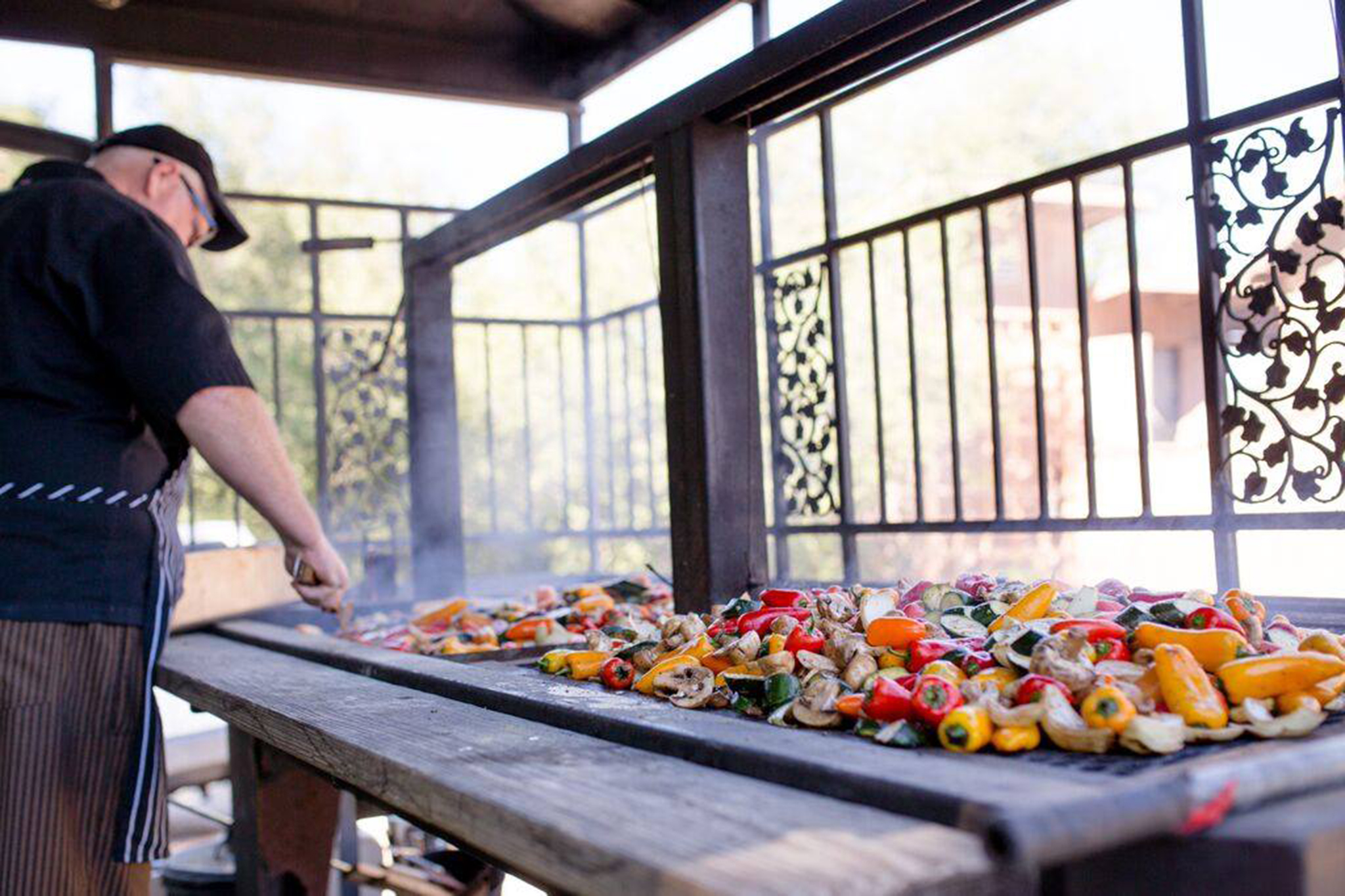
A single, low-res image that tells the client's story in a clear, compelling way is worth more than a hundred glossy stock photos that aren't actually of them.
In part, I solved this problem by just saying fuck it.
As a publisher, repeated experience has led me to an unwavering belief: a single low-res image that tells a subject's story in a clear, compelling way is worth more than a hundred glossy stock photos that aren't actually of them. So be it. The images—even the large ones greeting visitors at the top the homepage—would be slightly low-res. But they would tell a true story.
The other part of this solution was to keep the photos small. In the past, when it really meant something to have hi-res photos, if you wanted your website to look legit, it better have massive full-width, hi-res images. These days, though, the scarce has become common.
But maybe it still matters? How do we know? Well, does Instagram do it? No. No, Instagram does not. Instagram seduces users with small, pleasingly square photos with lots of whitespace.
Well okay then—that's what we'll do. We'll make the photo bits feel like Instagram. We'll make things small. I trust Instagram as a source of human design truth. Everyone loves Instagram. I mean what's not to like? So many naturally-lit house cats, and not even much fighting in the comments section.
Having first encountered Russ and Linda at the onset of their journey, it has been gratifying to witness the powerhouse the Hidden Table has become. Russ and Linda are two kind-hearted, ambitious, hardworking individuals who bailed from the security of corporate jobs into open water, with the intent to bring something unique and wonderful to the world. Over time, with a passion for service and impossibly high standards, they succeeded.
As they rocket upward, I cherish having been able to lend my own weight to their inertia.