Tape Op Magazine
Building an online presence for the world's most beloved magazine about recording music.
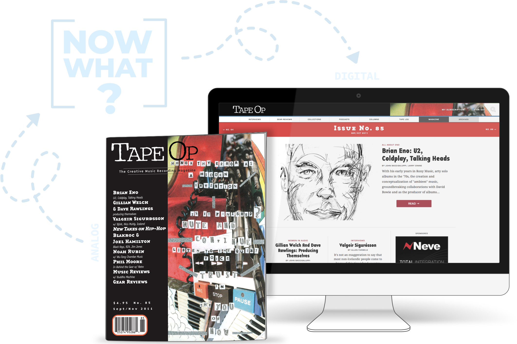
In my early 20s, aside from all the usual early 20s things, I was fumbling and groping my way through a nascent career in music production. Sometimes during this period I would manage to swallow my pride and solicit career advise from smarter, cooler, more established musicians. The more I did this, the more I noticed a common imperative:
"Do you read Tape Op?"
"You really should be reading Tape Op."
"When I started out, I read every issue of Tape Op I could get my hands on."
"You just have to work your ass off. But also, be sure to subscribe to Tape Op."
It turned out Tape Op was a bi-monthly magazine utterly devoted to recording music. It was founded by John Baccigaluppi and Larry Crane, two working-class, west-coast recording engineers with well-known bodies of work, and despite feeling incredibly home-grown (which it was), it had the largest circulation of any magazine of its kind.
The Anti Rolling Stone
Each issue of Tape Op was an ardent love letter to the craft disguised as a dense trade publication. Celebrity readers like Pete Townsend and Trent Reznor elbowed out space in the letters section alongside unknown kids recording songs in their bedroom to weigh in on and debate particulars of the profession. Its centerpiece was sprawling, spontaneous, conversational interviews with music industry professionals ranging from glaringly famous to quietly obscure. These interviews — full of humanizing tangents and random bursts of effusive technical talk — functioned sort of like an anti-Rolling Stone; instead of taking individuals and transmuting them into larger-than-life cultural icons, Tape Op took unimpeachable superstars of the musical world and made them normal people. You'd read an article and say, "They're excited about that same crappy $100 piece of equipment I just bought. They're talking about all the times they completely fucked up a project. They just spent half the interview trading anecdotes about their cats."
A clear message arose from repeated readings: we were all the same. We were all wide-eyed, nerdy kids astonished and in love with the magic of sound, and the profound emotions it could stir in us. Once every two months, Tape Op provided us a communal place to gather and gush.
Serendipity, etc.
By the time I moved from my hometown of Boston to settle in Sacramento, I had been visiting this communal place for years. When I offered to build a website (my first, though I omitted this fact) for the sweet, jovial owner of the recording studio I had begun working out of, I had no I idea I was talking to Tape Op's publisher, John Baccigaluppi. Later, when that studio website thing had played out surprisingly well and I did find out who he was, the fanboy in me was still reeling when John asked if I could do the same thing for Tape Op's online presence that I had done for his studio.
Uhh...maybe? I have no idea? Probably not? I said yes.
State of the Union
The current state of Tape Op's online presence was that it had no online presence. Or at least, not really. It had an old school messageboard that had enjoyed substantial traffic in the early aughts, but was rapidly sliding out of view in the shadow of the emerging Web 2.0 era.
Editorially, there was nothing. Tape Op's content existed exclusively on good old ink and paper, delivered via USPS. Meanwhile, around us, the landscape was shifting. People were reading their media online. Venerable newspapers were closing. Every major magazine was sinking millions into phone and tablet apps. Brick-and-mortar music superstores like Tower and Virgin were getting clobbered by iTunes.
So, my inaugural question as a publisher was the same one haunting everyone else in the industry: could a magazine survive the digital age, and if so, then how?
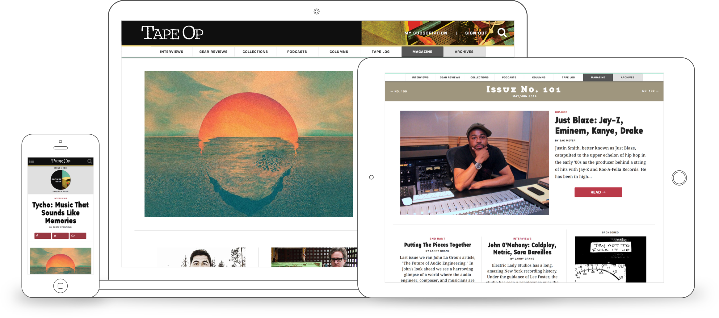
Editorial Website
In 2011, everyone who worked in media was in a frenzy over apps. Particularly iOS apps.
Apple had dropped the first iPad directly on the publishing world's head the year before, and it was reacting accordingly. Everything felt as if it were a doomsday and a utopian second coming all at once. All the big magazines were putting out these ultra high-end tablet apps with sweeping interactive layouts and sumptuous animations. All the tiny magazines were digging their heels in and championing the perennial value of print (they had watched indie record stores flourish while their corporate megastore contemporaries became ghost town warehouses overnight, and were banking on a similar trend). No matter who you were though, you were concerned about surviving the radical change to come.
Fear of Pirates
One thing no one appeared to be doing was moving their editorial content directly to their website.
I blame in part the current app craze (you may fondly remember that period when someone blurted out, "there's an app for that!" at least once in every conversation), but there was more to it than that. The era of free content, the Thank You Economy, and certainly creator-subscriber relationship services like Patreon were embryonic at best. Having come to stature during the printed word, most publishers viewed their content as one would material goods: they would be stolen at the first opportunity, and once stolen they would never again be paid for. The only reason the public did not flagrantly steal magazines and books was because there was not a safe, easy, and effective means to do so. From this lens, the internet was a terrifying place.
This helped to explain the industry's rabid rush to create iPad apps for each of their magazines. On its face the motivation appeared to simply be that an iPad looked and felt very much like a magazine, and so we finally possessed a rich, full-color (sorry 2011 Kindle), recline-in-chair-after-long-day sort of digital reading experience comparable to ink-and-paper counterparts.
Yet such capability already existed on the web, and iPads had browsers. Moreover, a toe-in-water foray into mobile app development revealed a lumbering deployment process fraught with headaches. Updates to code could take two to three weeks to go live, and if anything wasn't to Apple's liking after that time, they could simply reject the updates. Comparative to this, web publishing was unbelievably nimble. Updates were a git push away. So why on earth not simply just publish to the web?
Fear of theft. Publishing via Apple's closed app ecosystem removed the threat of internet piracy. You couldn't copy the text. You couldn't copy the images. You could possibly share, but only through means regulated by the app itself. Basically, everything that made Apple's haters hate, made publishers see them as their greatest hope.
So was this concern real, or just paranoia?
Some steady research revealed a reliable trend: these fears were indeed valid, but only if you were a true behemoth of a company. I couldn't find a single case where companies smaller than a Coca-cola or Microsoft didn't benefit hugely from so-called piracy. Basically, when it came to content-based products, the average loss from piracy was always less than the visibility and consequent customers gained in free advertising. Everyone wanted to "go viral," but going viral was predicated on content that was rapidly sharable. Premium, protected content — i.e. the best content — was always under some sort of lock and key; the only way to make it shareable was to steal it.
I decided that mobile apps simply weren't worth it for small publishers. To hell with "rich, interactive multimedia experiences." We would focus on delivering to the digital world what we already knew and were already good at: simple text and images. This is what the web was made for.
I couldn't find a single case where companies smaller than a Coca-cola or Microsoft didn't benefit hugely from so-called piracy.
I also didn't buy that the public of the future would be entirely consumed by video and multimedia. Yes, video — when done well — was amazing and uniquely engrossing. And increased video consumption by the public was clearly inevitable. But magazine publishers didn't know how to make good videos. Moreover, my observations had been that people still cherished the written word. They weren't abandoning reading; they were abandoning paper.
I made my pitch to John and Larry and it was decided: a good article delivered simply beat a mediocre multimedia experience delivered with the latest fad. Web piracy had no real teeth for us. We were putting 15 years of content on the web.
Choosing Technologies
Tape Op's new website was the largest digital project I had ever taken on by an order of magnitude. At that point, I had zero experience with any web technology beyond the humble trio of HTML, vanilla Javascript, and CSS with which I had built my static sites. What was a "blog engine"? What was "relational database design"? It was my first real introduction to this stuff, and I wasn't entirely sure where to begin.
The site needed to do a lot of stuff.
It had to handle a significant range of content types: letters from readers, interviews, articles, blog posts, product reviews, video, audio, and photo galleries. All of these needed to be either tied to an issue of the magazine, or published independently by date. Issues needed have their own information, and to be able to be bought by subscribers. Access to content needed to be regulated by which issues were owned by which subscriber. Subscribers and subscriptions themselves, of course, had to be orchestrated and managed. Automation and manual subscriber tools for newsletters, renewals, address updates, cancellations, and status requests needed to be in place. Analytics and data viz for the state of subscriptions and our subscribers' demographics were also a crucial component of our lifeblood, both for our own decision-making as well as to report to advertisers.
Despite my neophyte status, all of this seemed uncomfortably weighty and complex for a pre-fab blog engine like Wordpress or Moveable Type — what everyone was leaning towards at the time. Yet the idea of building all this from scratch seemed insane. Fortunately, I had a single "real programmer" friend named A.J. who showed me the light.
"Web frameworks, dude. Best of both worlds."
Holy shit. They make those?
They did make those. The two big ones at the time were Ruby on Rails and Django. Rails was more popular — by kind of a lot — but these Django folks said their thing was first built specifically for a freaking newsroom. This seemed very difficult to argue against. Plus, the framework was named after Django Reinhardt, one of the raddest and most unusual jazz musicians of the early 20th century. And we were a magazine about music recording. So. Yeah. I imagine you get it.
We chose Django to put Tape Op on the web, and I was set on my path towards being a died-in-the-wool python developer. It was time to learn a metric shit-ton more about programming than I currently knew.
Finding the Look & Feel
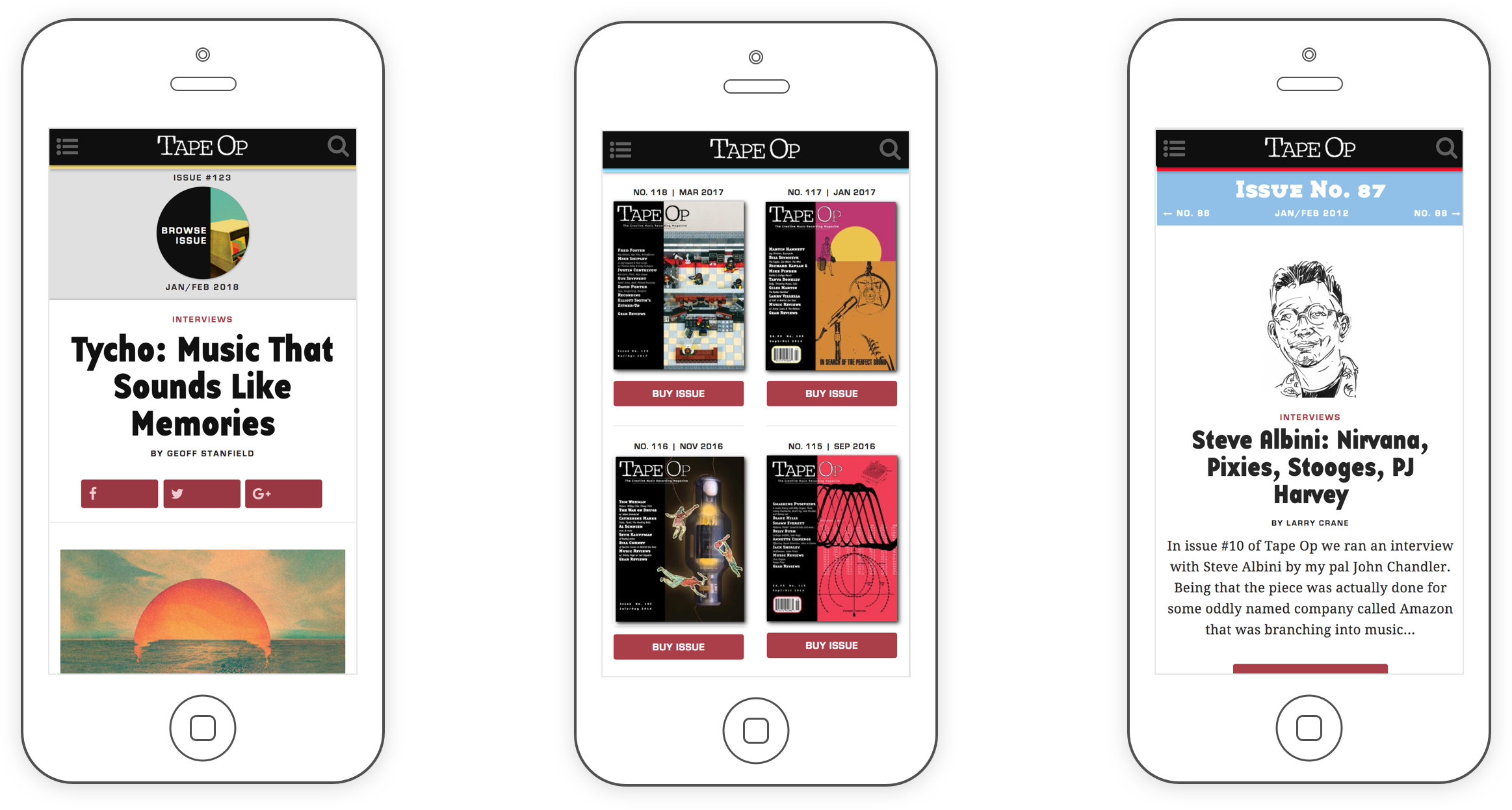
For the front end, I had one primary design principle: ruthlessly preserve all the things that made Tape Op unique and intensely beloved, and depart radically from anything that only existed because of the necessary constraints of print. If these two things overlapped somewhere, get a vote from the staff.
For the preserve-at-all-costs list, we ended up prioritizing the print magazine's signature heading typography, humanistic artwork, and anti-gloss, underground-rag sense of humor and directness.
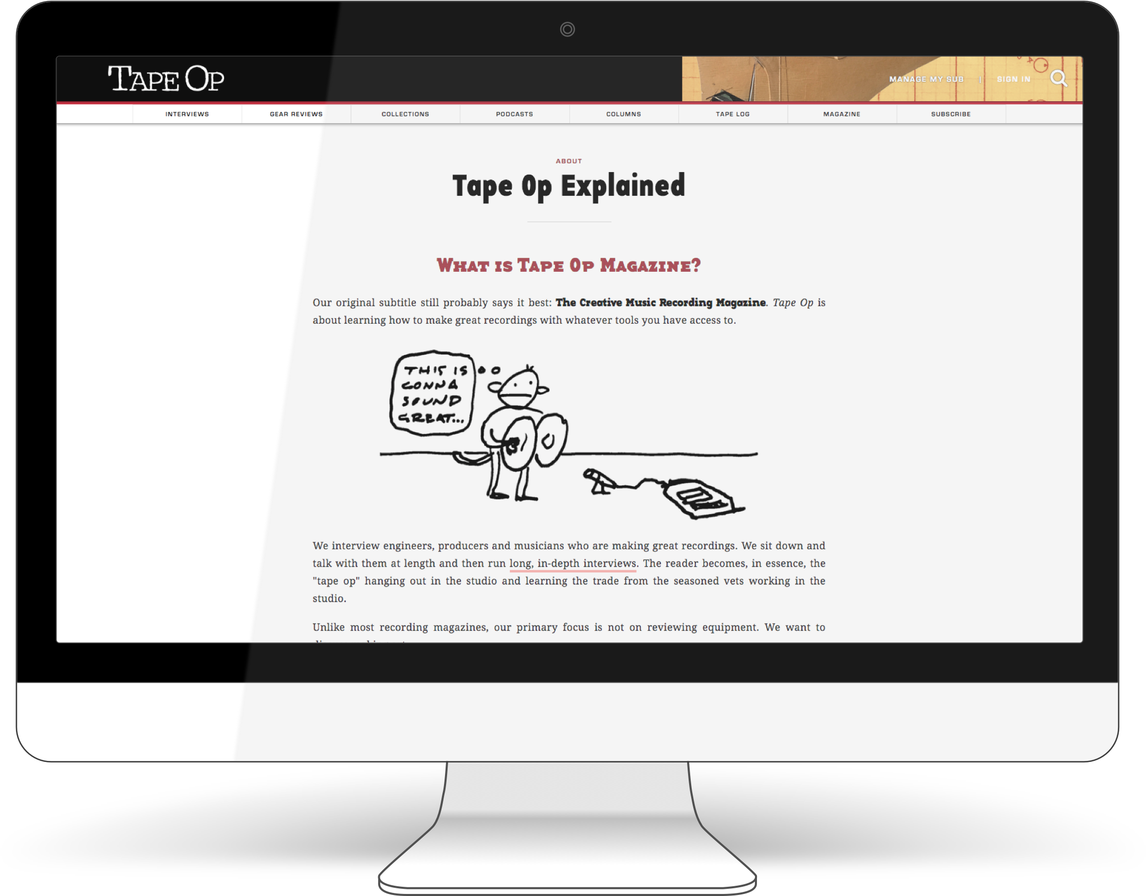
On the other side of things, we definitely found stuff to abandon. For example, Tape Op was notoriously text-dense. There was no whitespace in the article bodies, and tiny fonts. At first I thought this was some sort of device to keep the not-nerdy-enough out, and took it as a key design trait. Once I understood our business model better, however, I realized this was simply to keep printing costs way down and keep the magazine free. John actually would've killed to put out a beautiful, quarterly-journal-style publication with lots of breathing room, but we would've had to charge an arm and a leg to do so. On the web, where physical space is blessedly abundant, we could make this happen without penalty.
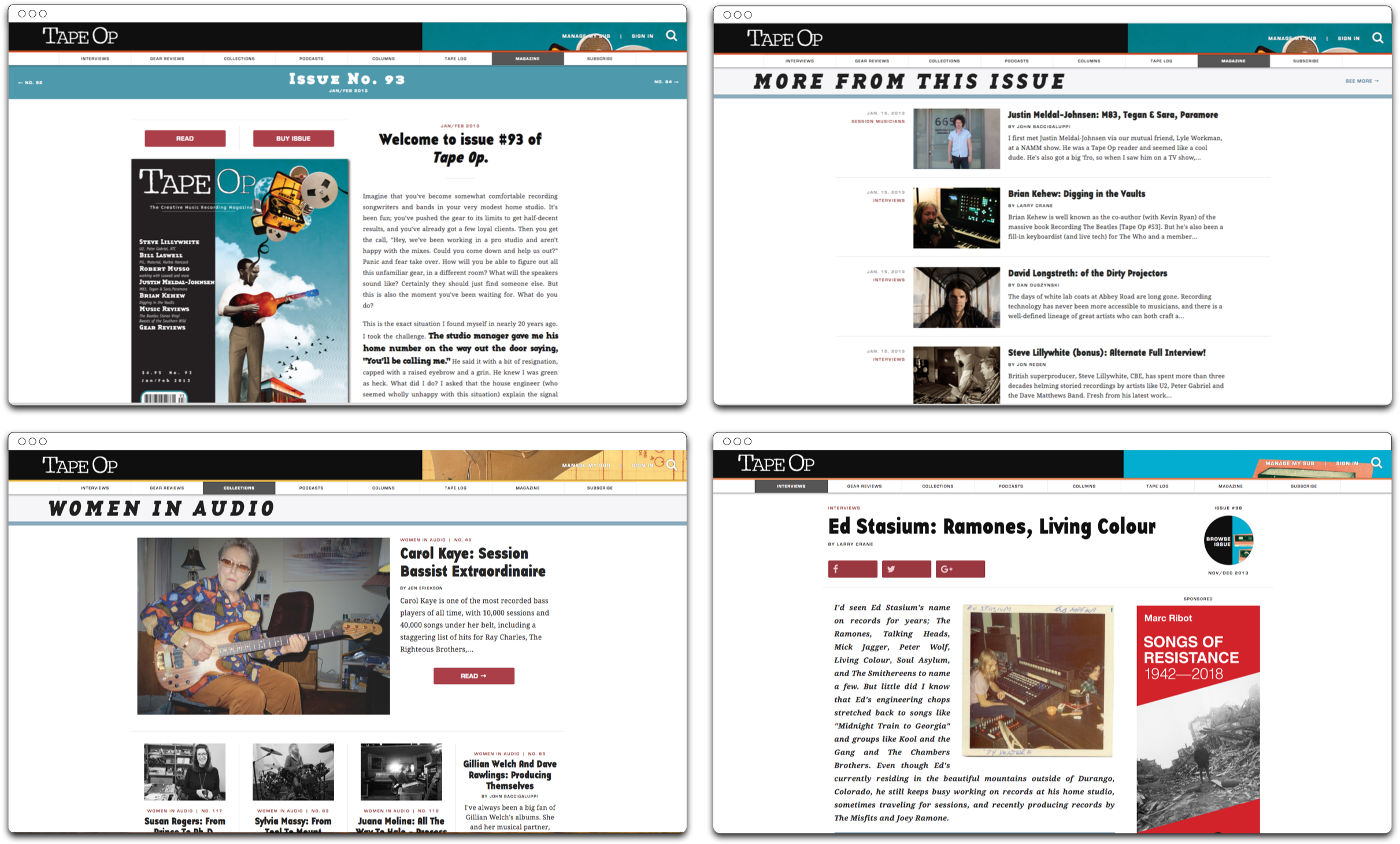
Before kicking off the design process, I spent a lot of time studying Wired and The New Yorker, two magazines from outside our market which were very different from each other, but that I admired greatly as shining examples of how an awesome web publication should operate. I loved the old-world stateliness of The New Yorker and the stylish futurism of Wired, and used them as inspiration and guides for adding generous whitespace and clean, sharp text layouts, with the aim of synthesizing something new that acknowledged the best in both of them.
Unified Subscriptions
Several months of long hours and a nose-bleed learning curve later, I launched our shiny new website. John went around that year's trade shows showing advertisers and leading with, "Hey look, our website doesn't suck anymore!" We got strong reactions. Some of our most sophisticated advertisers did double takes and declared we had gone from zero web presence to the best web presence in the industry. We were all pretty stoked.
Yet the future still had major gaps. That same initial question persisted: was the printed page dead? Print was dead! Or was it? Everyone had a strong opinion but no one really had any idea.
The Lifeboat vs. the Vampire
The answer to this question mattered to us quite a lot. If indeed there was an impending Printed Paper Apocalypse, our digital magazine could serve as our lifeboat, allowing our articles, subscribers, and entire ecosystem to bail off the old sinking ship and land in the digital realm to continue business as usual. On the other hand, if print stayed strong, there was concern that an overly strong digital presence would actually hurt us.
This is because the lifeblood of the magazine came from print ads from audio companies, most of which were run by old school music industry veterans (if images of grey hair slicked back in pony tails and cigar puffing flooded your mind, yes, you nailed it). Almost all of these people profoundly distrusted any advertising medium that had to do with computers and www’s and things you couldn’t hold in your hands.
There was also a problem with how circulation numbers translated from print to online. From a sales standpoint, it took about ten online visitors to equal a single print magazine reader. i.e. when presenting numbers to potential advertisers, 10,000 print subscribers carried about as much weight as 100,000 online visitors. If a bunch of our readers dropped their print subscription for the convenience of online reading, the loss to the old medium would be 10x the gain to the new medium, which the folks we sold to didn’t even trust.
In other words, it could suck the blood right out of us.
To me, it seemed like there must be a third way. How could we have our cake and eat it too? How could we make it so that more online traffic always meant more print traffic?
United We Stand
One of the flagship facts about Tape Op subscriptions is that they are always free to readers. All our revenue came from advertising dollars. This was frequently met with raised eyebrows from the rest of the publishing industry, but it worked because of the particular fervency of our readers: a single new subscriber was almost certain to be a deeply serious music recordist, who was very likely to purchase thousands of dollars of recording equipment over their lifetime. So, one subscriber's eyeballs on our print magazine was worth more to us in advertising than the cost of postage to send it to them.
I realized that this fact would allow us to do something unusual: we could mail readers print magazines as casually as we sent them digital content. As long as our readership was filled with passionate recordists, it wouldn't feel invasive, and was no fiscal loss to us. And if we could do this, we could make a unified subscription experience that was the same for everybody.
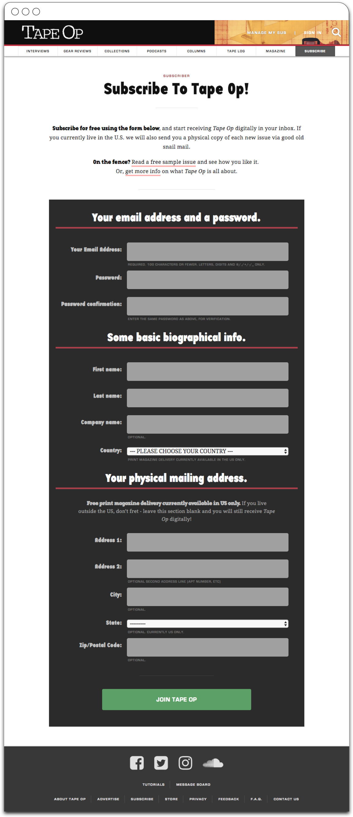
The unified subscription flow would ask for your email, a password, and an optional mailing address, and then subscribe you. No matter what, you could then read our content online, and receive new "digital issues" in your inbox (a simple PDF). If you gave us your mailing address, we would also mail you print magazines. I reasoned that very few readers would opt out of the mailing address because, hey, free magazine devoted to your favorite topic. To me, it didn't feel spammy; it felt like a personal gift.
This meant that every time Tape Op got a new subscriber, both our print and online circulation would go up.
Yes. This was the third way. I got to coding.
Simple Is Good
Once launched, this unified system ended up benefiting us in all sorts of ways. The PR was awesome, as in an industry where print circulation was falling across the board, ours was actually rising. Our readers got a much better user experience, with a single, simple subscription flow and one clear opt-out option that could be ignored without hassle. Our old-world advertisers were also satisfied — the percentage of readers that opted out of print delivery was extremely small, and even when they did, the fact that readers received a PDF in their inboxes that looked identical to the printed magazine seemed to be enough for them.
Digital Magazine
A funny fact about most serious audio engineers: they kind of detest modern digital tech. They do love technology, but old technology. Analog technology. Technology built with vacuum tubes, RF, and satisfyingly heavy, military-issue power supplies, instead of printed circuit boards, svelte beveled edges, and wifi. This all sprouted from their daily craft: much of modern music recording was spent in hot pursuit of re-capturing the golden era sounds from decades past, and those sounds were decidedly not created on an iPhone.
For many of our readers, this sensibility applied to things like magazines, and it presented us with a new problem: our more future-friendly readers embraced reading our content directly on the web, on their phones or tablets — i.e. what is utterly normal today — and loved it. Yet many of our traditionalist readers were clearly not ready to accept this way of reading. They typed slowly, and with the firm precision of fingers that grew up with typewriters. They powered down their computers when they were done using them. They did email, but if the web wasn't the yahoo.com homepage, they stayed away from it.
A funny fact about most serious audio engineers: they kind of detest modern digital technology.
We had talked to quite a few of these folks and gotten clear feedback: to them, a "digital magazine" was a file that you clicked on and opened and looked just like the regular magazine, but on your computer screen. One older engineer laid it out more directly:
"Gentlemen, it's simple. Just email us a PDF of your magazine. Isn't a PDF literally what you send to the printing press anyway?"
Uh, yep. Exactly that. So why didn't we do this? Everyone else was tied up in mobile apps and fear of pirates but not us... right? Well, okay, so we were still a little scared of piracy. We all felt it was playing a little too fast and loose with our content to send PDF masters flying out into the public. Mere hours after such a move, we imagined finding our entire catalog anonymously posted on every major internet forum with headlines like, "Haaaa Tape Op's SOOOOO STOOPID"
This would not have been a real issue if we were only concerned with the United States, but we wanted to use the web to make proper subscriptions available worldwide. We had significant demand in Europe especially, but their were too many obstacles for print delivery: overseas shipping costs wrecked our free model, and paid subscriptions were a logistical nightmare across different countries. Digital was the clear solution, but just as in the U.S., many readers did not seem ready to go online to read stuff.
When In Doubt, Go Punk Rock
The fact that we couldn't just give readers exactly what they wanted because of the threat of some anonymous anarchist was quite annoying. Surely there was a solution to this that didn't involve ceding our independence to some third-party app ecosystem? How do you protect a PDF and not make it a hassle for readers?
I kept churning on this during the trade shows that year, until someone said something offhandedly that stuck with me. Evidently a decade earlier there was some tiny piece of software for Windows XP that took an email and added it as a watermark on a PDF. Oh! Punk rock piracy protection.
The lovable jankiness of this approach really appealed to me, yet it would also adroitly solve our problem. The watermark could be so light that it was barely noticable, yet if someone posted a PDF somewhere, we could trace it easily to its source. Readers would have a simple file that they could do whatever the hell they wanted with, and it would work everywhere. It was infinitely shareable yet secure.
The website backend already dealt in individual issues and how they mapped to subscribers and their emails. I just needed to code an engine that generated watermarked issues, and then connect it to an action URL so it would run only when requested. (It should be noted that my first idea was to batch-generate the files synchronously, until I did the math and realized it would take a full month to deliver magazines to all our readers this way)
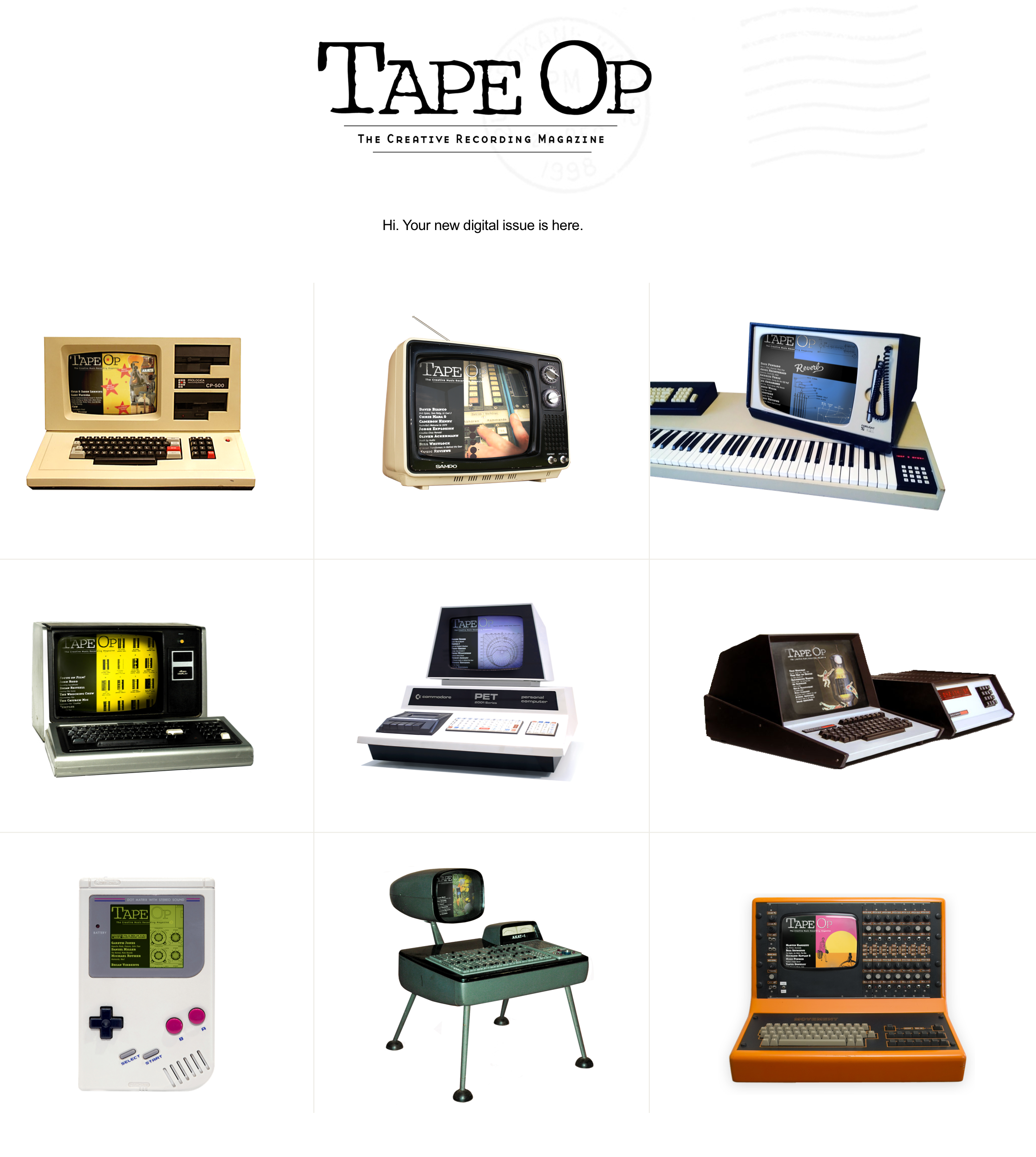
This engine took some experimentation and time — mainly due to sorting out performance reliability at scale — but was fun to build, and in the end worked pretty damn well. The "victory lap" portion of the project was creating the new issue notifications to email to subscribers. I received such emails from other publications with digital versions and they always had their magazine cover beautifully photographed on the latest iPad or phone. I thought Tape Op's version of this could be more suitably lo-fi.
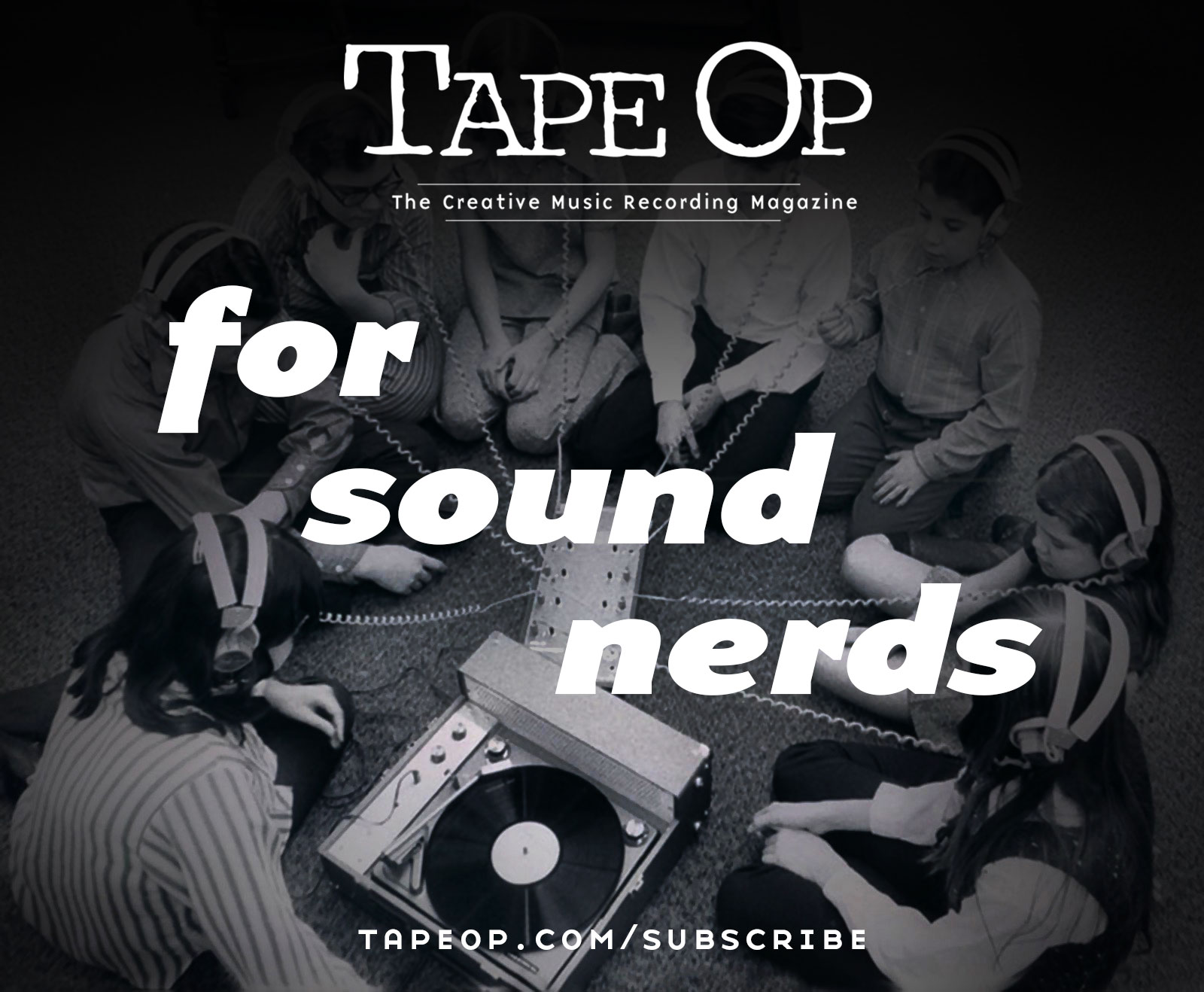
Somehow, against the more conservative voices in my head, all of this actually worked great. Honestly I was kind of shocked. Tape Op announced "digital subscriptions now available worldwide!" and our total circulation quickly leapt up about 25%. Our traditionalist readers and advertisers seemed content. And we had managed to stay clear of app ecosystems and maintain complete autonomy for our digital publishing process.
Advertising
With its DIY digital magazine in place, Tape Op's digital infrastructure was beginning to feel like a legit thing. Our construction phase was coming to a close. The website and its core features worked smoothly and reliably, and did the brand justice. Now, how do we get more readers to it?
Tape Op's web traffic numbers were steady, but modest. I am speculating here, but I believe this was due in part to our boutique audience, and how essential it was that we consistently met their high expectations for content. Tape Op's editor, Larry Crane, had very careful standards for anything we put out — we only covered music recording, and within that, we heavily favored people, creativity, and art over technology and gear. We willfully steered clear of clickbait headlines and topics. We also only ran advertising for recording gear we genuinely loved, and never more general products outside of our industry (e.g. no random car commercials).
This was limiting from a marketing and SEO perspective, but worht it because of our unified subscription funnel — new web traffic that was mild by online-only metrics would reliably convert into new print subscribers, which kept our core revenue stream nourished and strong. Yet there was room to grow. The ubiquity of easy-to-use laptop recording software and egalitarian web-based music publishing platforms like Soundcloud hinted at an ever-widening community of bedroom recordists that would delight in what Tape Op had to offer. I really wanted to reach them.
At last, a digital platform.
Now, how are we going to get folks to visit it?
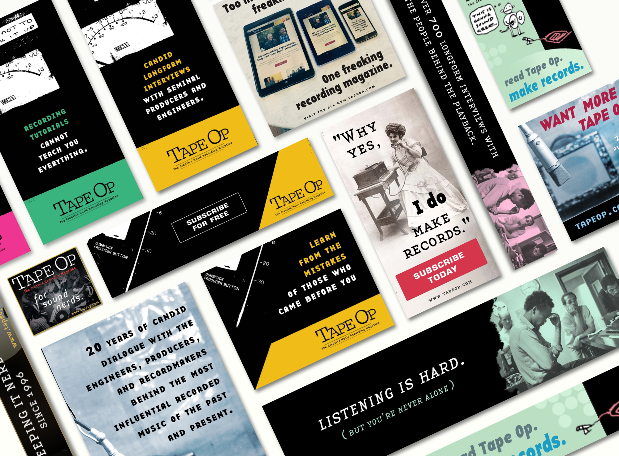
I created a series of banner ad campaigns designed to speak directly to the audiences we could benefit the most — passionate new recordists who wanted to learn more, and were burnt on trolling through bite-sized YouTube tutorials on this or that microphone technique, or the latest hyped piece of equipment. People who were more about the artistic end than the technical means. Individuals who wanted to learn everything they could directly from the minds of their heroes. I also tried to speak to recordists searching for a community who shared their ethos and commitment to craft. There were a lot of places that talked about gear, and not many places that talked about experiences.
At the time I was a much more seasoned designer than marketer, and my straightforward banner ad approach to getting the word out was not particularly sophisticated. That said, it helped. When combined with a tag team effort between myself and our excellent social media manager, we definitely were able to gain some ground. It also provided some core lessons for me in effective copywriting.
My time at Tape Op was crucial to every aspect of my present professional self. It provided me with my first major leap forward as a programmer. It taught me about publishing, advertising, and design. It provided me with a sterling brand and a built-in devoted audience, and an arena with real feedback and real stakes within which I could experiment and learn how to build a robust, flexible infrastructure and a strong, unique online presence.
More crucially, it taught me that finding solutions outside established norms — e.g. "thinking for yourself" and "following your heart" — is more than just rah-rah entrepreneural rhetoric from Silicon Valley hopefuls. Novel and powerful solutions to very real and scary problems can indeed arise from following one's inner compass. Sometimes the conventional choice is the correct one. But sometimes, when enacted with measure and care, being unafraid to move against the crowd and into wide open water can yield tangible, effective, and wonderfully surprising results.